Role:
User testing, User experience, Visual design, Agile design
Year:
2012 / 2013
Boundless is a community for Christian young adults who want to own their faith, date with purpose, and prepare for marriage and family. It is one of the top Christian sites for 20-30 somethings, creating weekly content through stories, blogs, and podcasts.
In 2012, Boundless decided it was time for a redesign so they asked me help them refresh and redefine how users experience Boundless.org.
It started with a logo…
Boundless had recently updated their logo and brand strategy, and they wanted their new website to not only match the new design, but to also rethink their entire website structure from the ground up. Working with an agile team of developers, content strategists and marketing managers, I took the lead in the redesign.
UX & Strategy
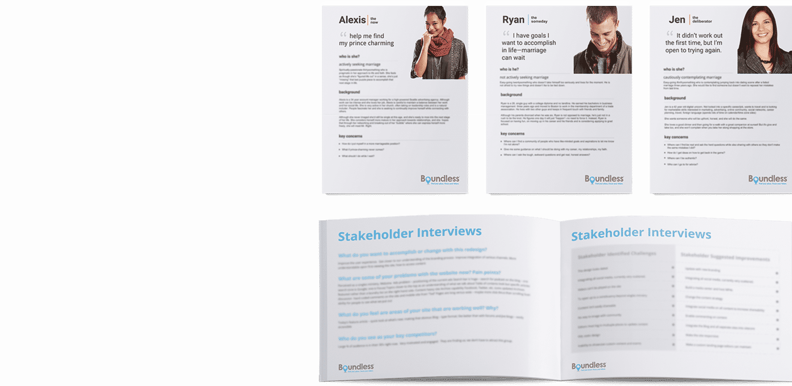
Understanding the target audience(s) is paramount to any website, and Boundless was no different. Through research, three user personas emerged that became the basis for the recommended approach. From these user groups, I was able to hone in on specific needs and behaviors to ensure the new Boundless would meet expectations.
I also analyzed historical data to ensure we were improving on areas of opportunity while bolstering features and functionality that had proven successful in the past. I worked with the Boundless team to conduct user surveys to hear directly from Boundless users to make sure we were building the right things. Multiple rounds of user testing, such as open card sorts, helped solidify our decisions, particularly around the site’s navigation.
We also held large strategic meetings with marketing managers, content editors, and developers to put together an exhaustive list of requirements that could be refined and standardized. The results of these discussions and the exhaustive user testing became the foundation for the new Boundless.com.
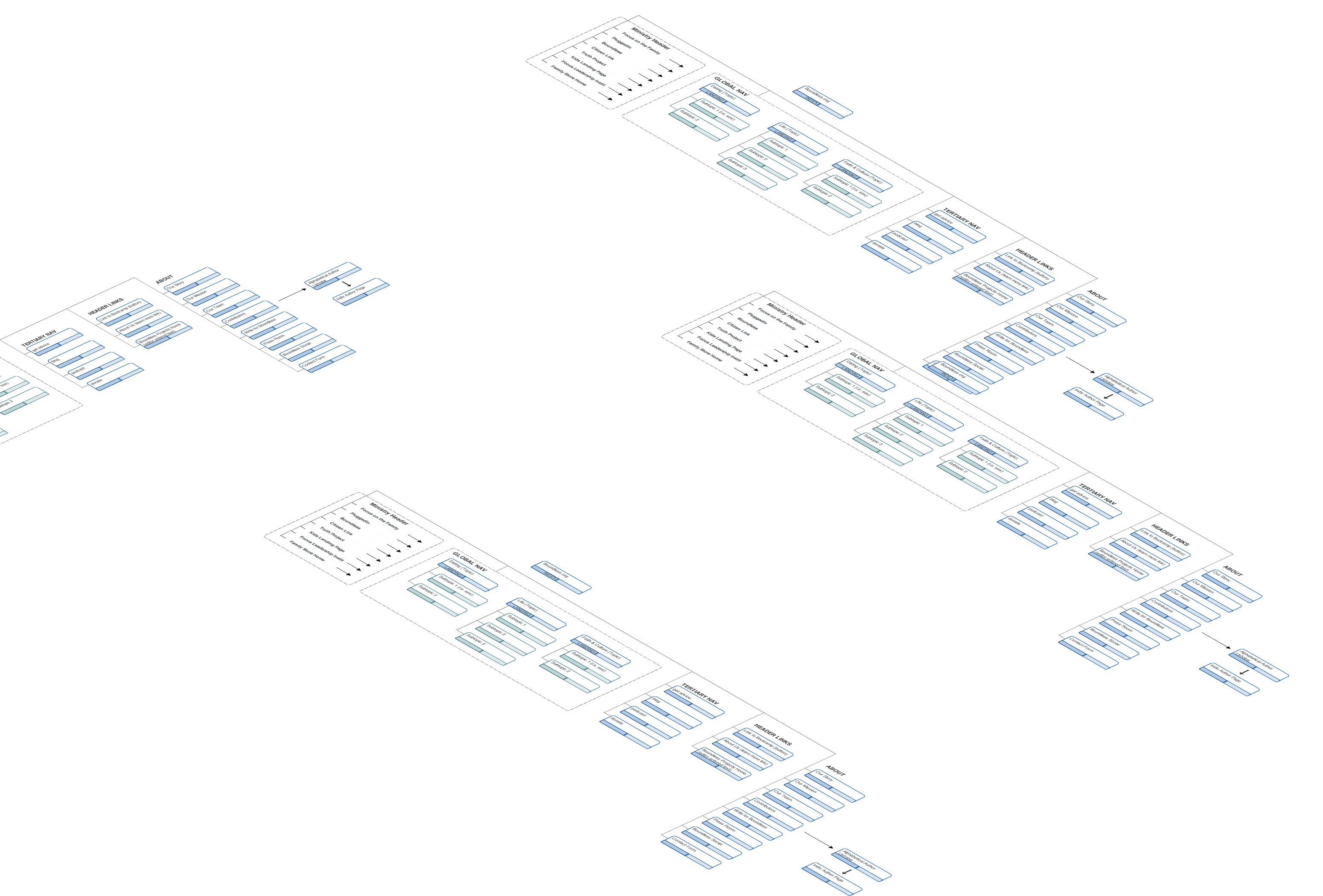
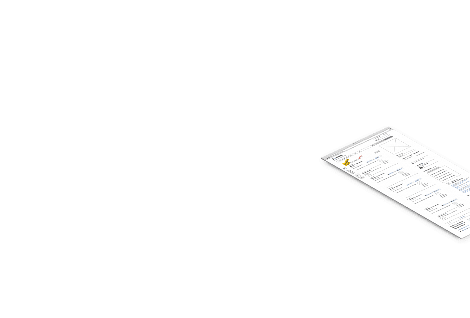
Wireframes
Once I understood what was required for a successful redesign, it was time to define the visual framework of the site. I created wireframes to accommodate for user paths, page content and design layout. The wireframes and site map established a go-to reference that informed page design and what content would be prioritized.
Ready, Steady, Build.
We used agile design to develop the Boundless website. Working closely with the developers, product owners, and content creators the site was delivered in iterations, and we released features in increments, adjusting after real-world use.
User Stories
User stories became the building blocks of the project. Because I had created initial wireframes off the user and client requirements, we were able to distill some of our user stories through the design itself. Other stories came from the marketing managers and developers.
Development
From the user stories, developers had the resources they needed to code the requirements into life. I worked closely with the lead developer to do a lot of iterative design and front-end updates as templates were being built, and this process allowed us to see how changes would work across layouts and browsers.
Testing
Once a feature was delivered, I tested it against the user requirements to ensure the feature passed acceptance criteria.
Design
After months of iterative design cycles and successful client meetings, we launched the new Boundless.org in March 2013.
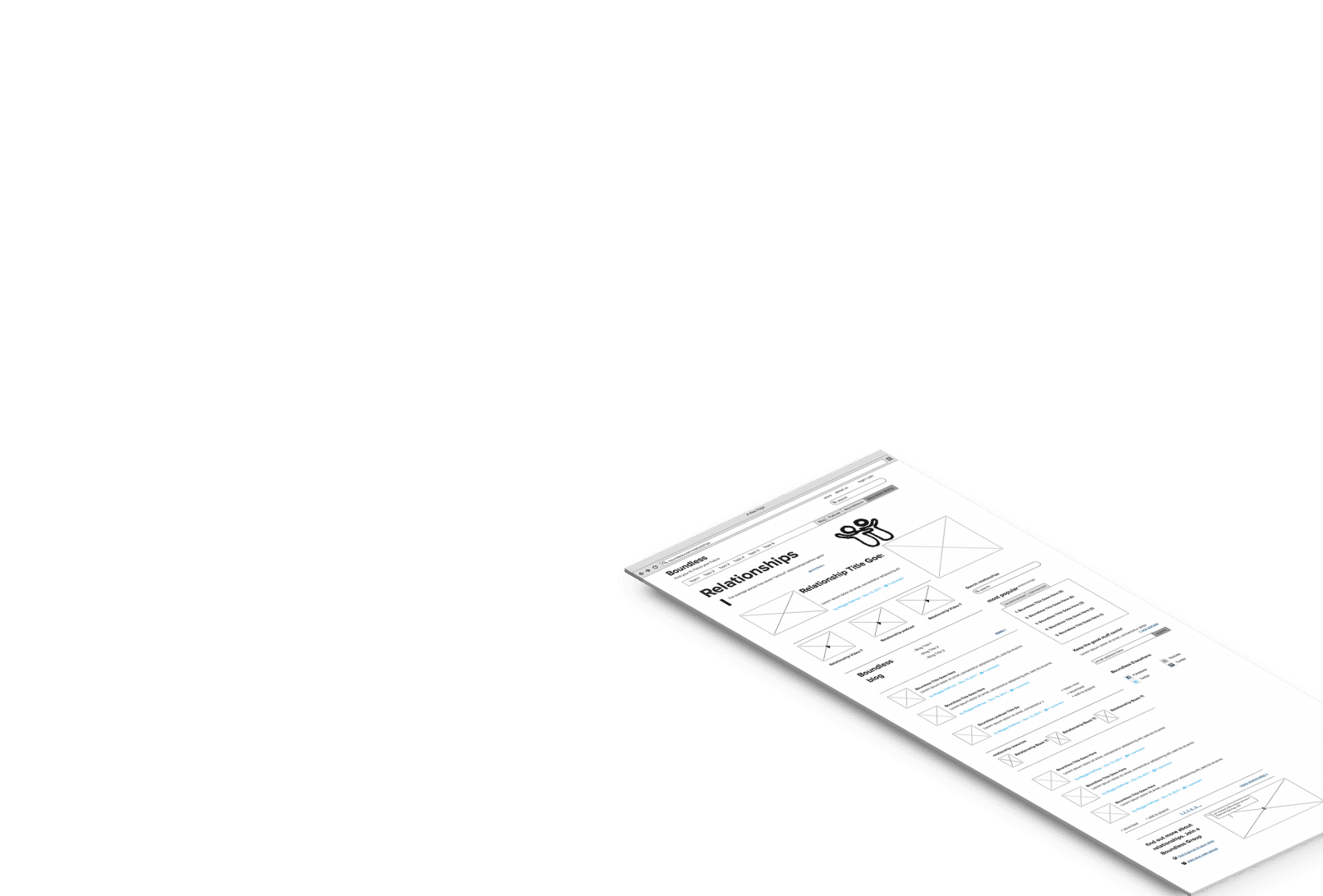
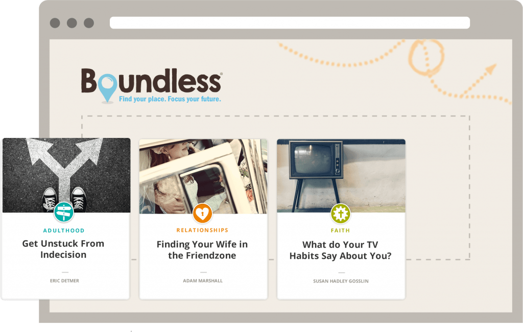
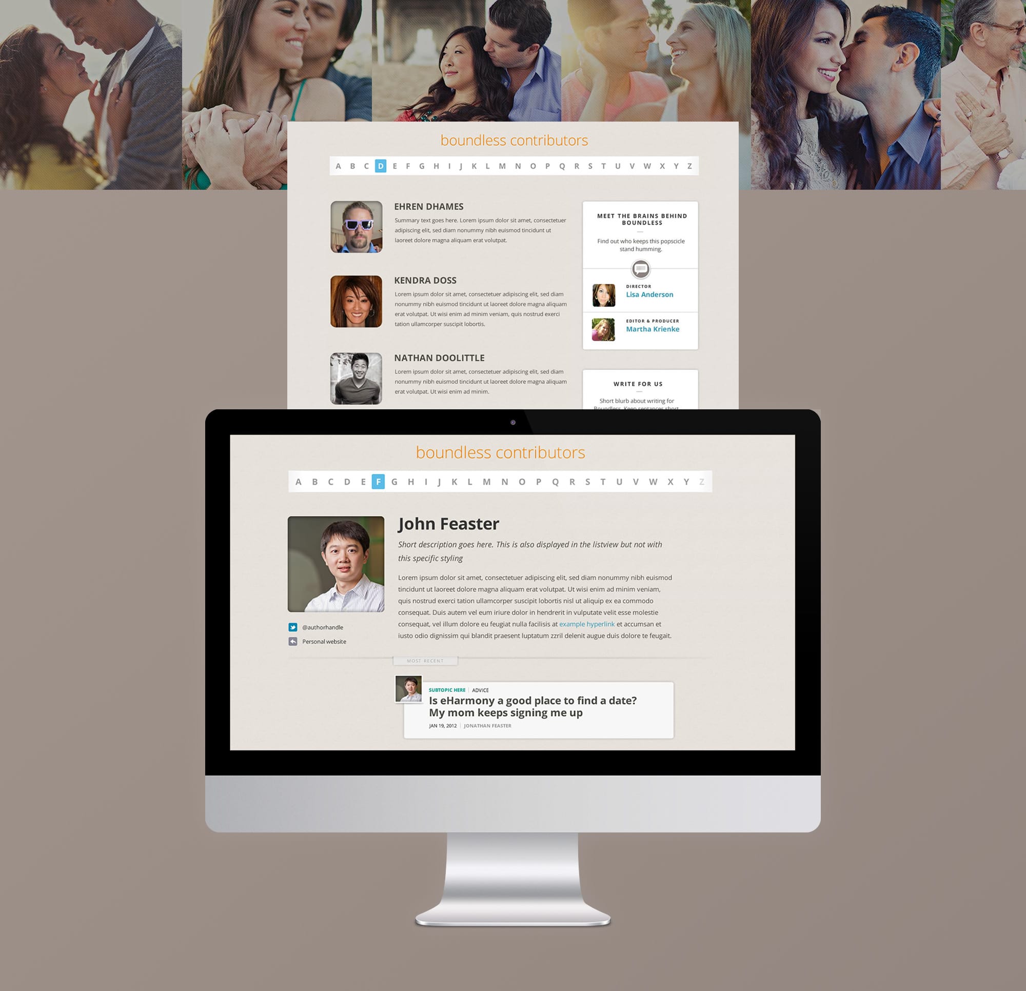
Increasing Content Findability
Boundless wanted to increase the findability of content so we created combined listviews that blended multiple content types on topical archive pages which maximized the discoverability of site content.
Updated Branding
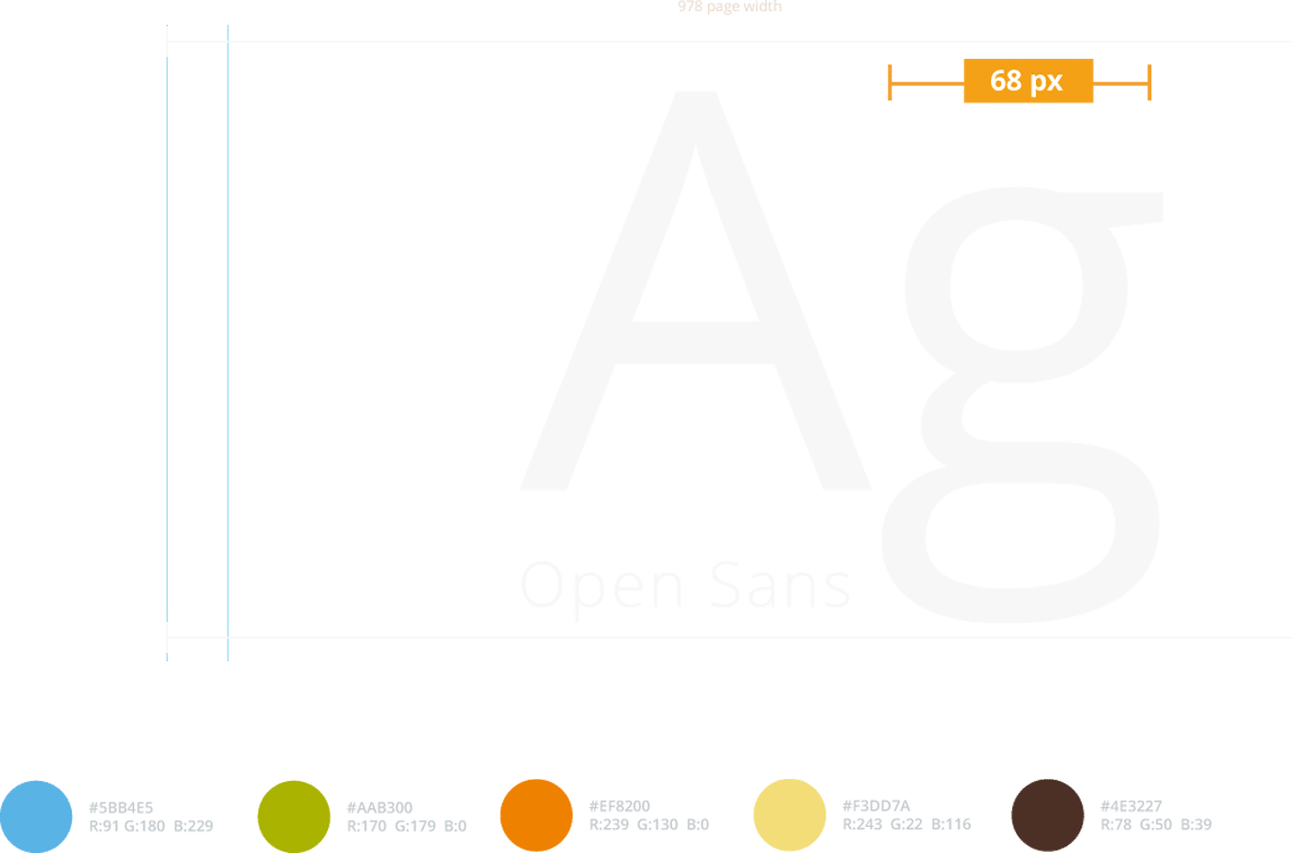
The new Boundless.com featured warm colors and unique iconography. Content was grouped topically by color and the iconography made it easier for users to find their way.
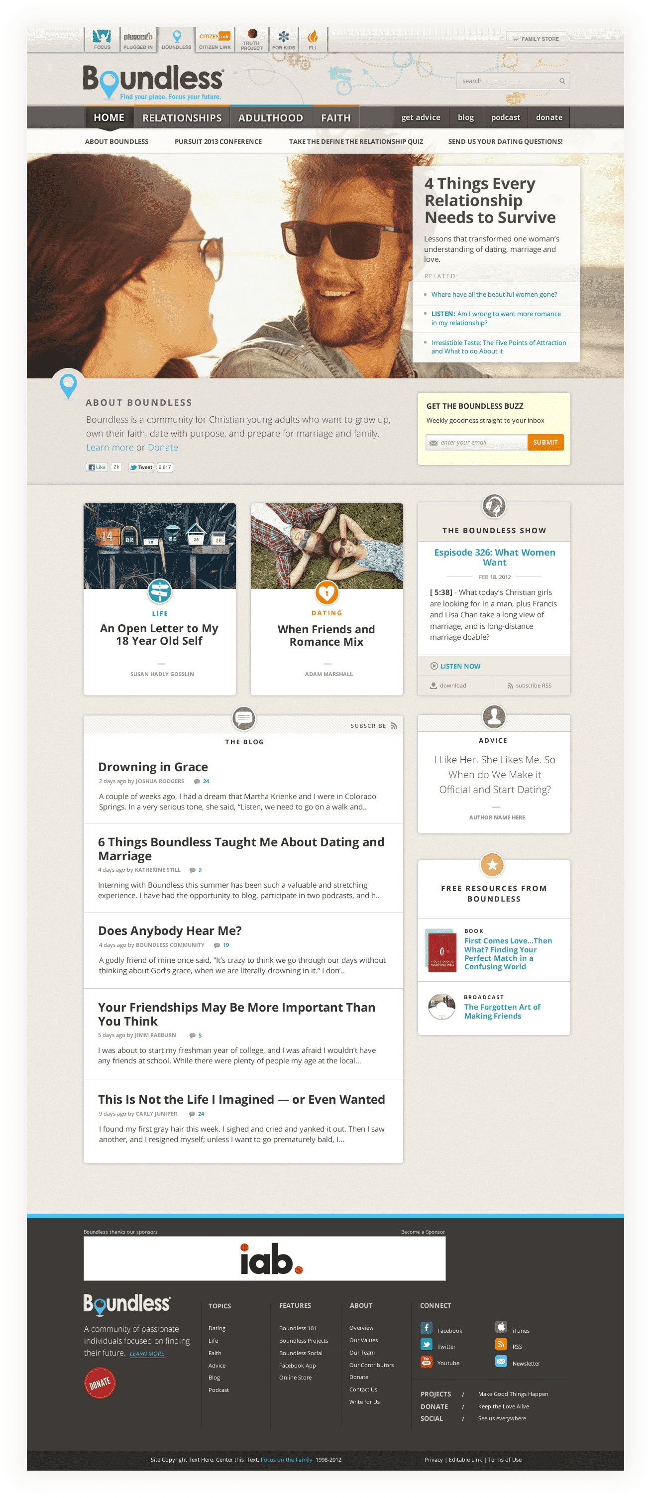
New Content Landing Pages
We jettisoned the site’s original structure, fashioning a more coherent and empowering user experience that brings content to the surface instead of forcing visitors to dig for it. A new taxonomy allowed content to be tagged by type or topic providing structure and predictability when navigating the site.
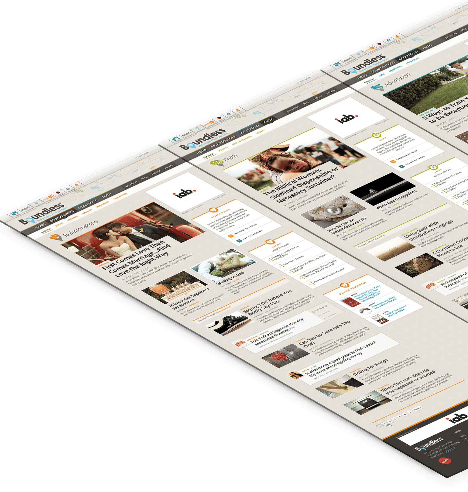
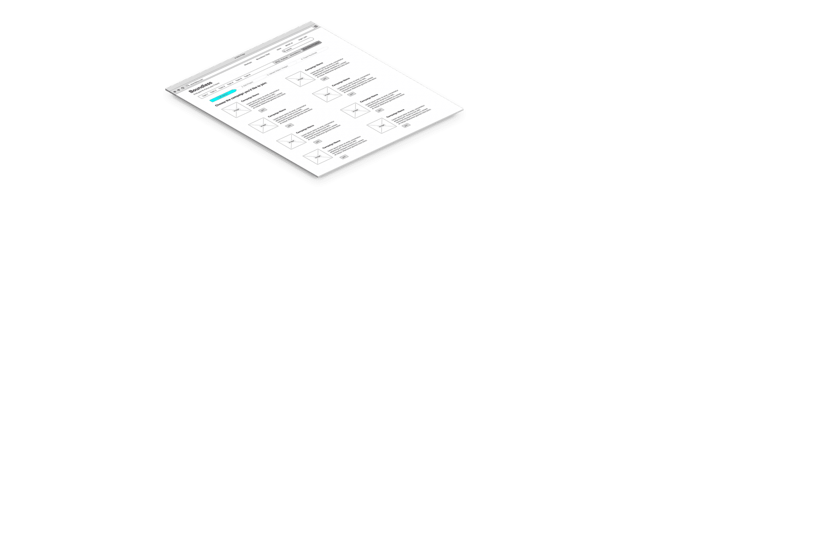
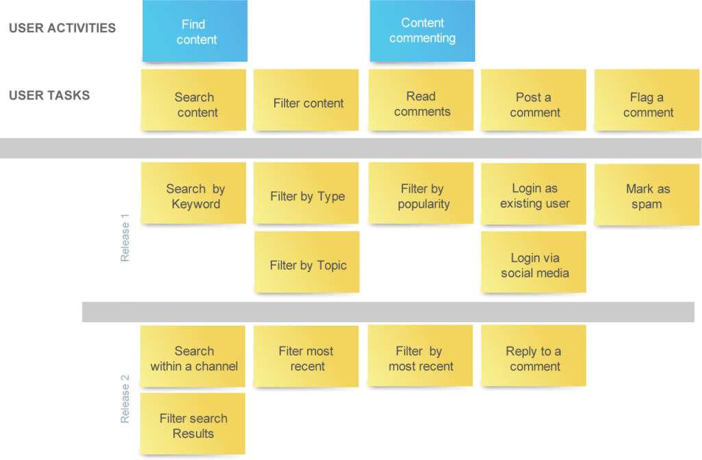
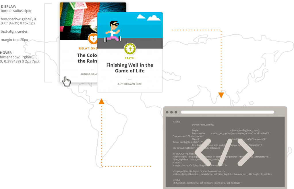
Building a framework
We created several templates to optimize all the different content types Boundless used across the site.
![]()
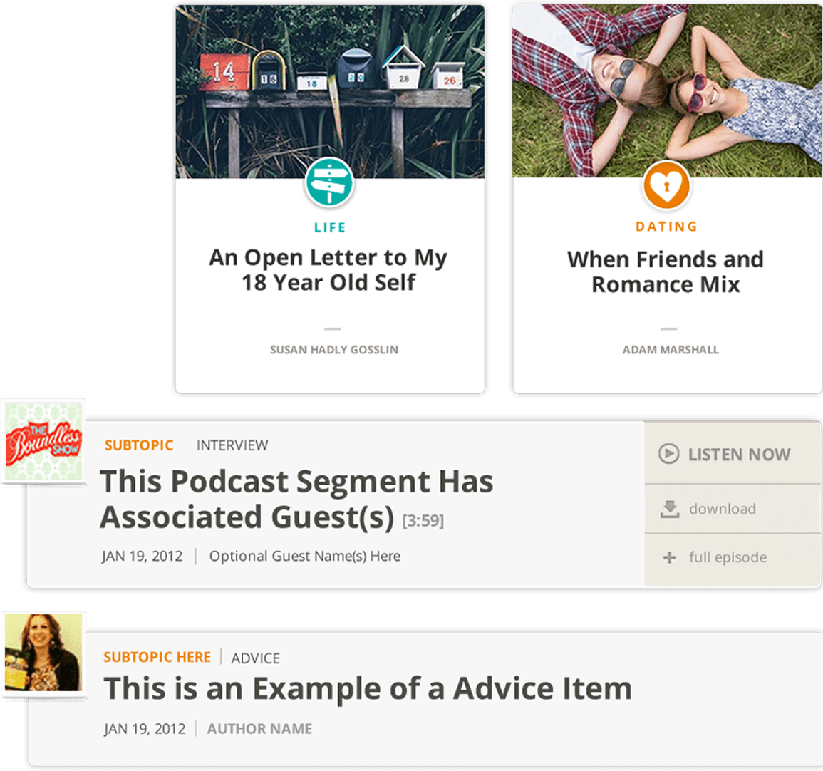
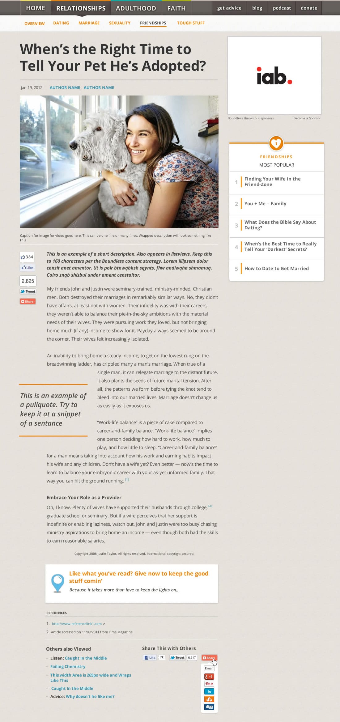
Article Template
Boundless articles were longer length pieces that required different modules for authors to effectively write articles. We created a toolbox of modules that authors could use to put together a story. Elements such as footnotes, image galleries, pullquotes, blockquotes, and contextual promotions were just some of the tools authors had at their disposal.
![]()
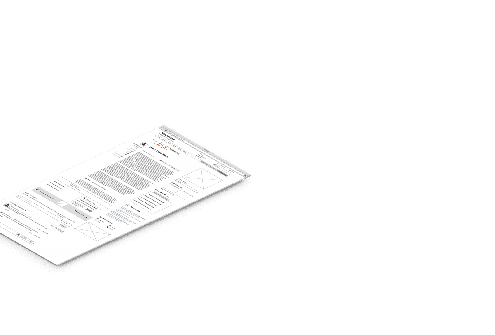
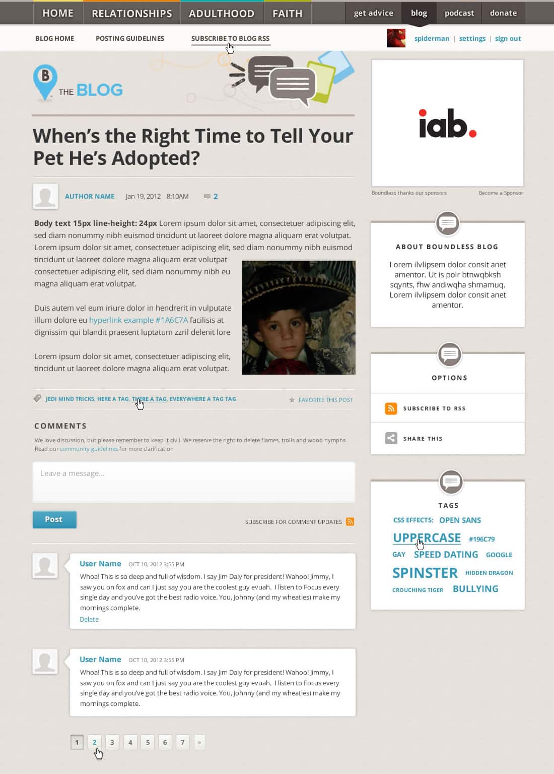
Blog Template
The Boundless blog template emphasizes commenting and sharing and had a different navigation and layout. The blog header remained persistent throughout the entire blog to denote this content type, and the layout emphasized the author behind the post.
![]()
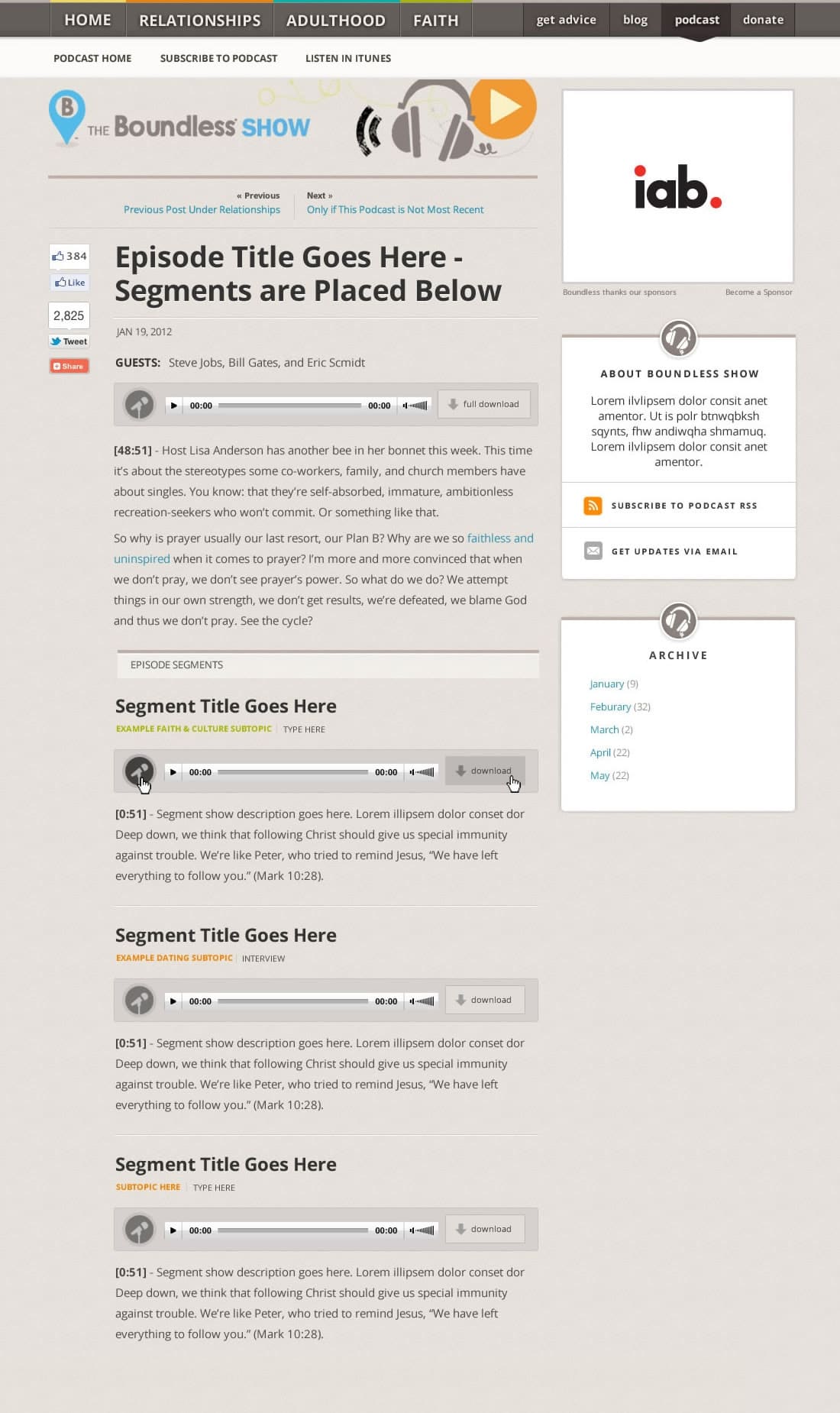
Podcast Template
Boundless produces weekly podcasts that cover a range of topics. Boundless wanted to not only give users access to the entire broadcast, but also to shorter, stand-alone audio clips they would cull from the show and upload separately. Each of these clips could be tagged separately and would not only appear here but also under the respective topical category.
![]()
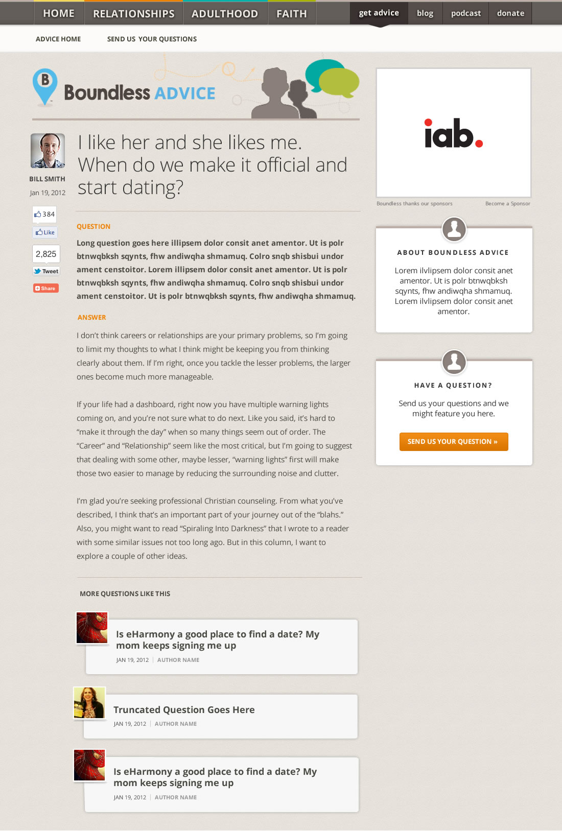
Advice Template
Boundless frequently asks its audience to submit questions that can be answered by its team of relationship experts. I created an “advice” template that highlighted this question-answer format and provided links to related content.

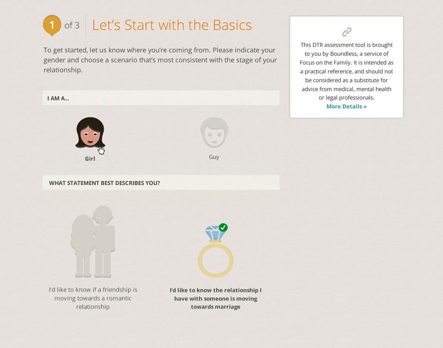
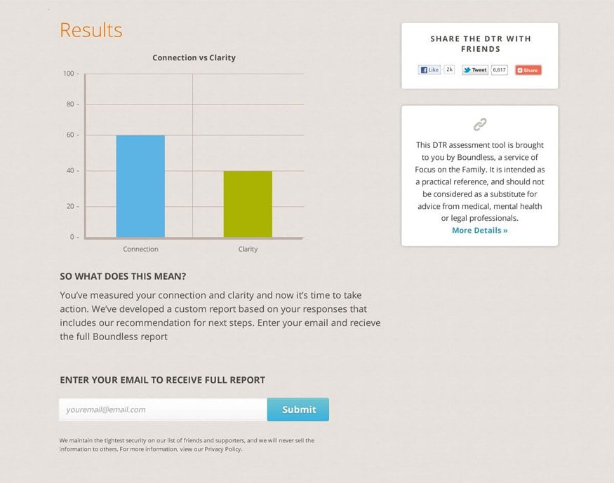
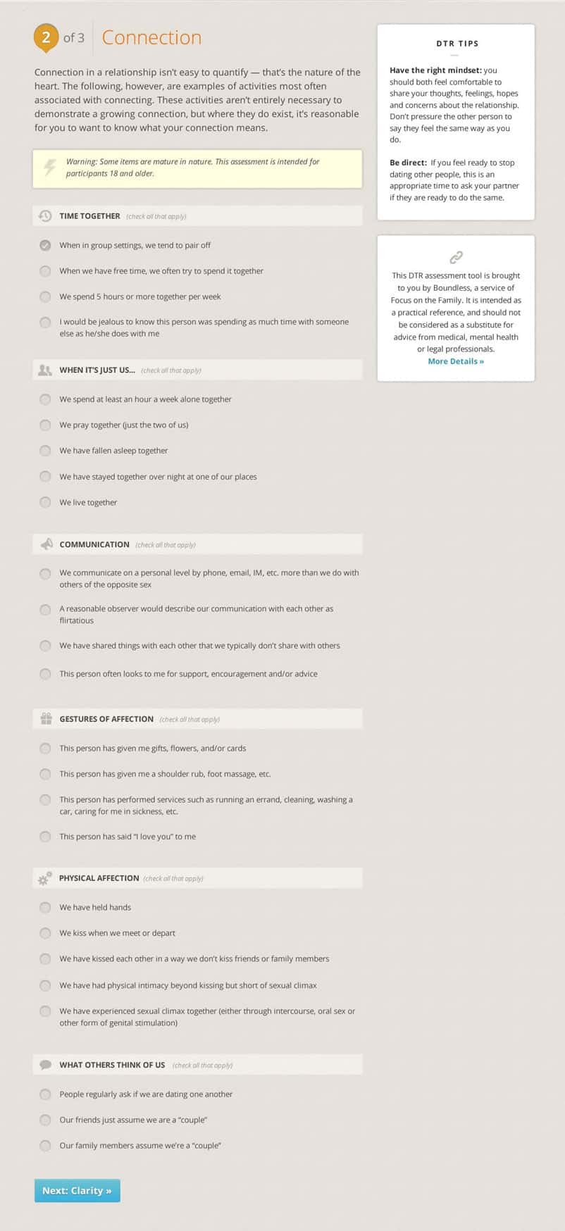
Define the Relationship Test
I worked with Boundless to relaunch their “Define the Relationship” test, which helped people understand the state of their relationships and where they might be headed. I redesigned the entire assessment tool and made it visual, presenting information in a clear design and made it easy to compare a relationship’s connection and clarity.
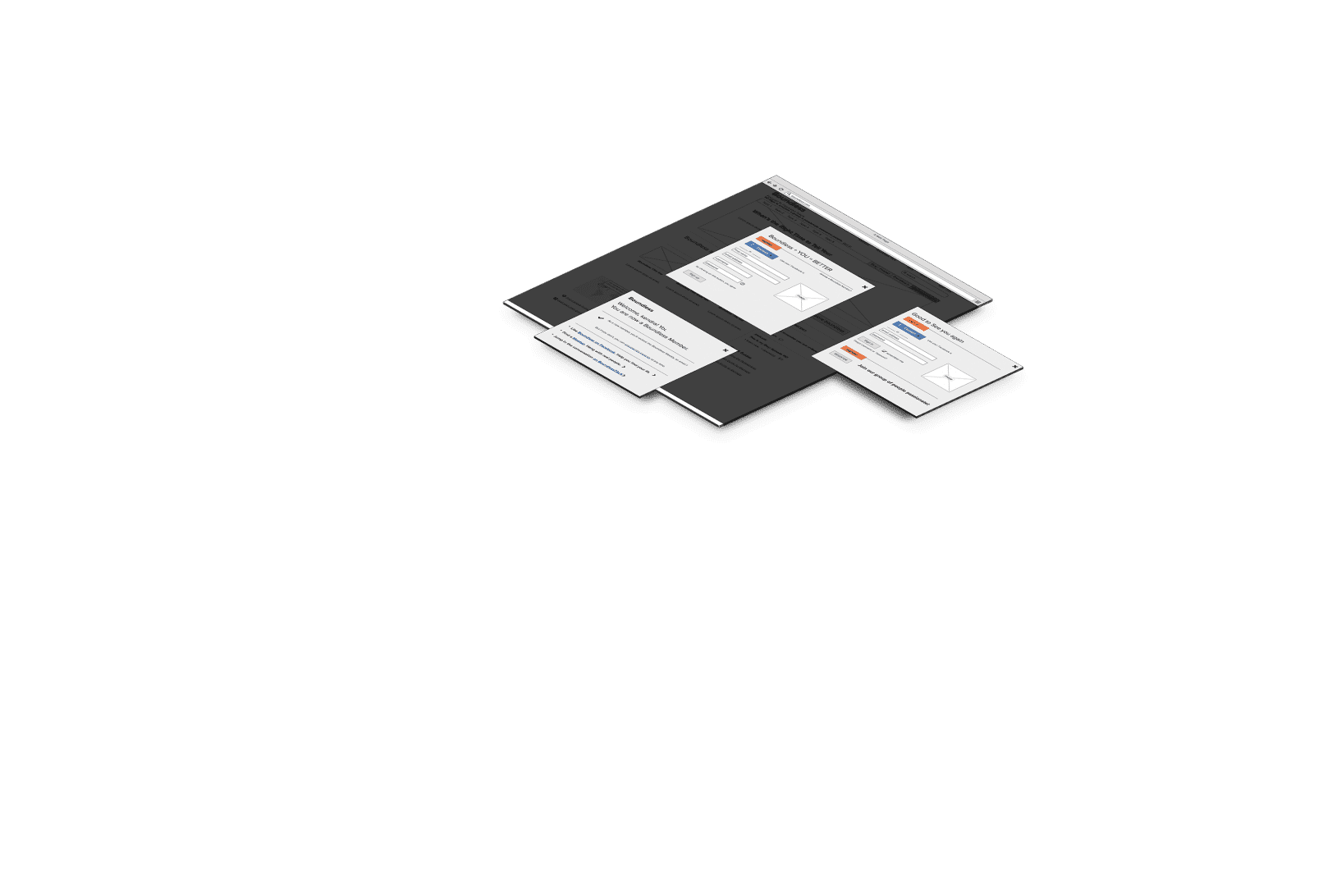
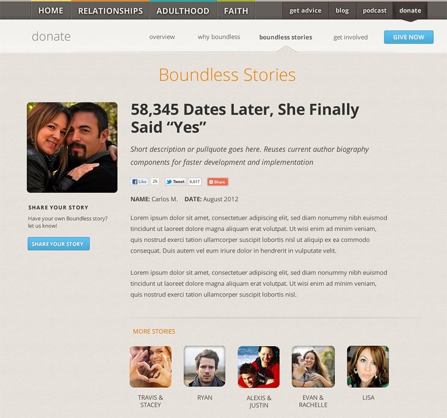
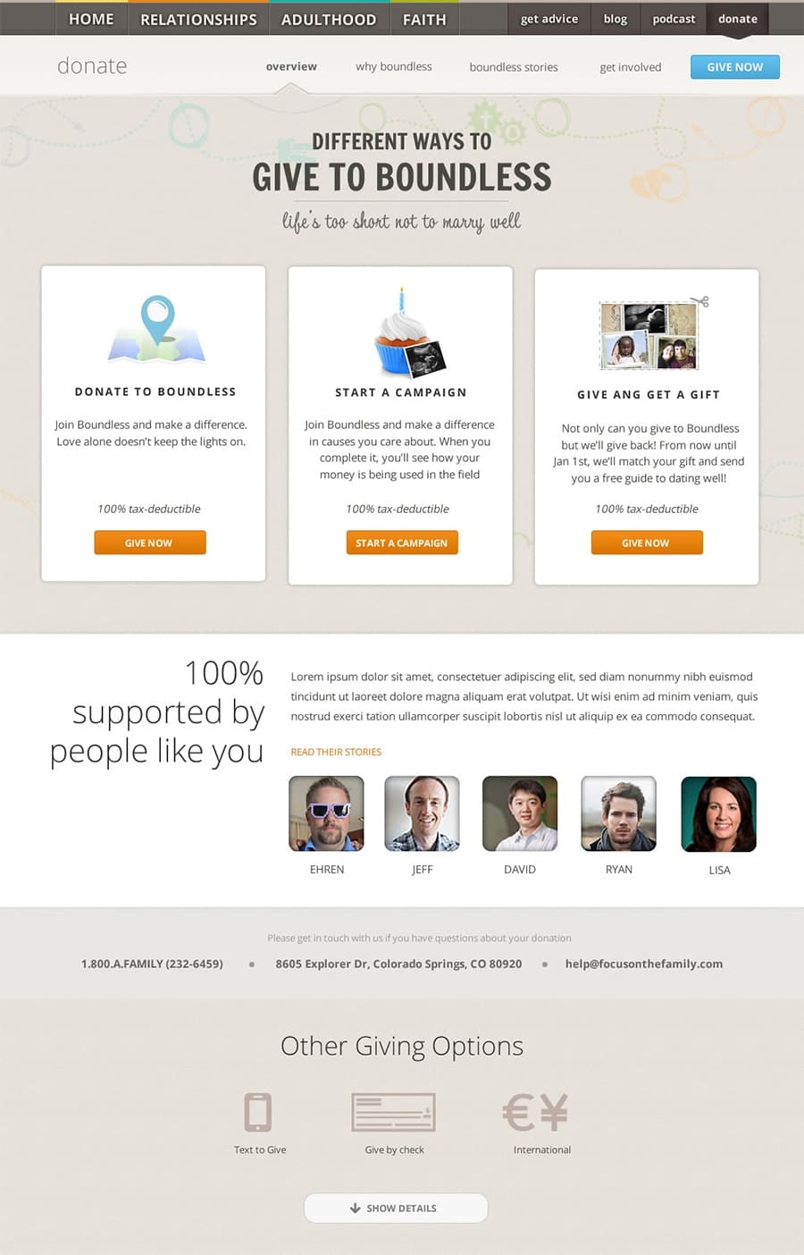
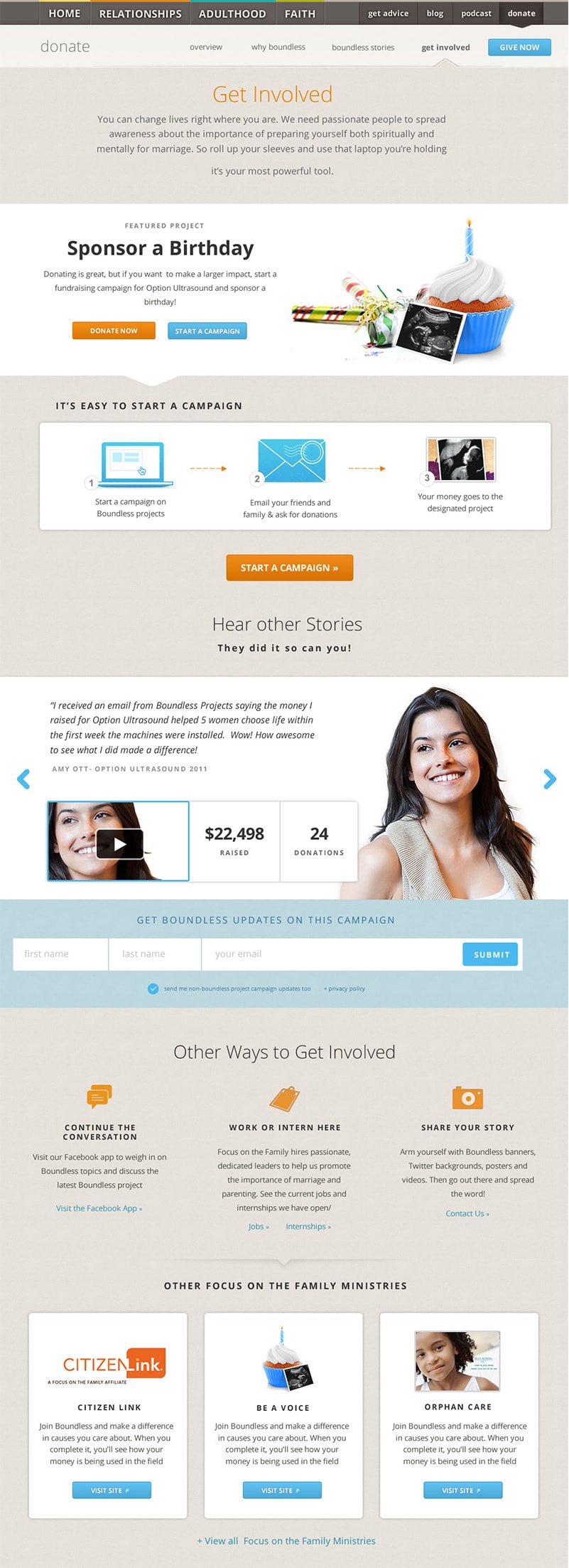
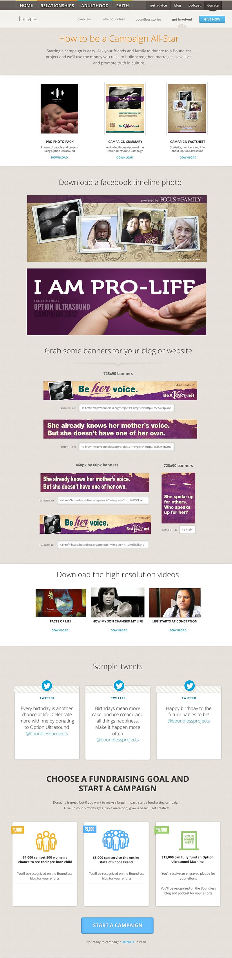
A new way to give
Boundless is a non-profit ministry and relies on the donations of others. I emphasized the impact donations have on the success of the organization while simplifying and improving the donation process through thoughtful UX. For richer engagement, we envisioned multiple ways people could give to Boundless and created a strategy to connect them with the larger work of the parent organization, Focus on the Family.

![]() Like what you see?
Let's Talk
Like what you see?
Let's Talk