Role:
User testing, User experience, Visual design, Functional specs, PHP development, Content management
Year:
2015 / 2016
Compassion International is an inspiring non-profit that has a heart for the world’s most vulnerable population–its children. Through the use of sponsorship, they are helping children escape poverty to live fulfilling lives. Compassion Magazine is Compassion’s quarterly publication that goes out to all sponsors, and it plays a vital role in educating sponsors about the issues of poverty, shows them the direct impact of sponsorship, and informs them of Compassion’s work worldwide.
I was involved in the initial redesign of the Magazine’s website and managed the site post launch, conducting user testing to optimize the reading experience and making improvements to the website to align it with the Magazine’s updated publication strategy.
A strong print foundation
Compassion Magazine has a long, rich history of using stunning graphics and good design to tell the stories of children worldwide. To better align its online presence with its print magazine, Compassion Magazine decided to redesign its website so it could publish stories more efficiently and make stories accessible across a range of devices.

Hit the ground running
When I came onboard, the redesign was already underway, but I worked with the print designer to refine the wireframes and make sure the final delivery was consistent with the magazine’s publishing strategy.


Specc’ing it out
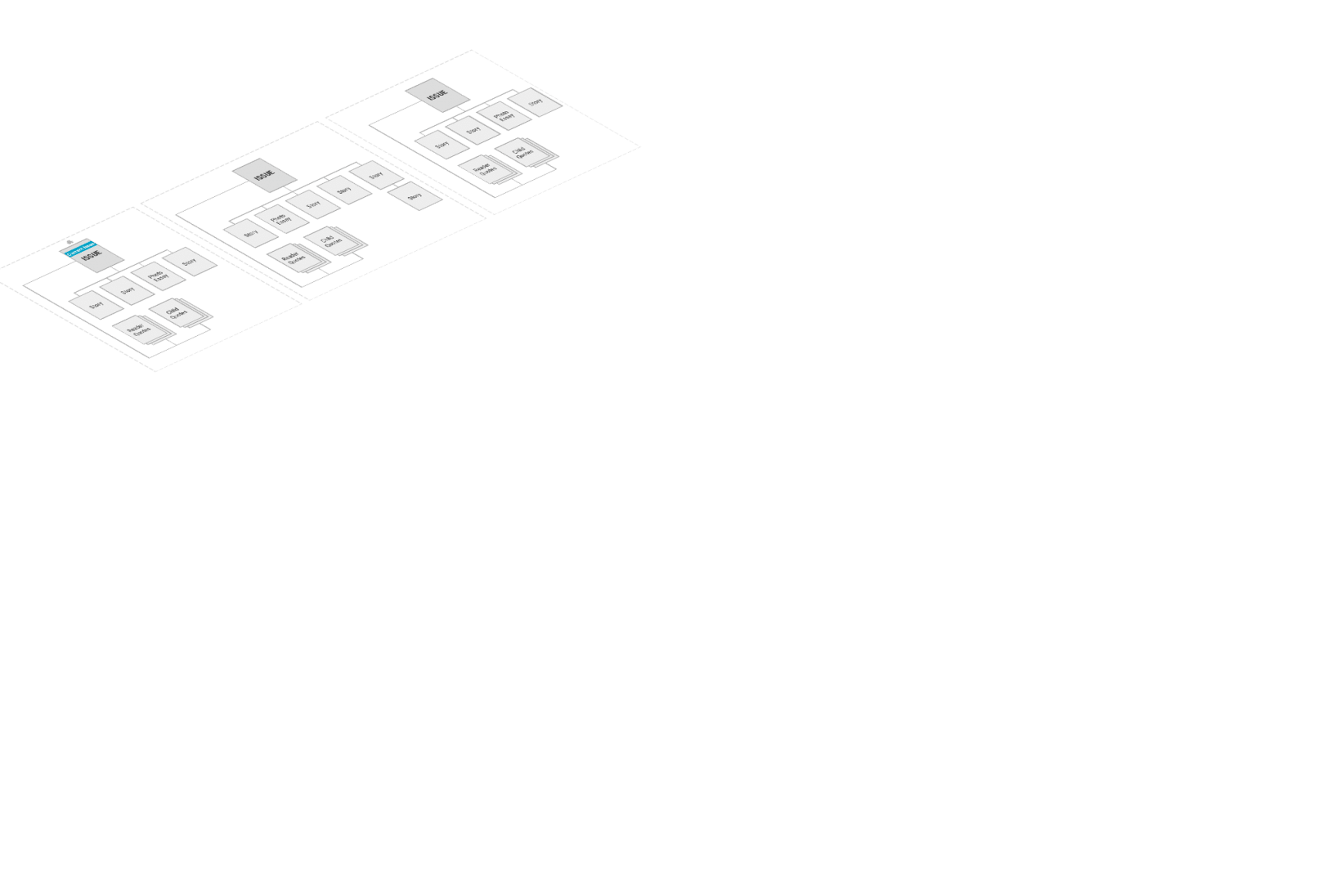
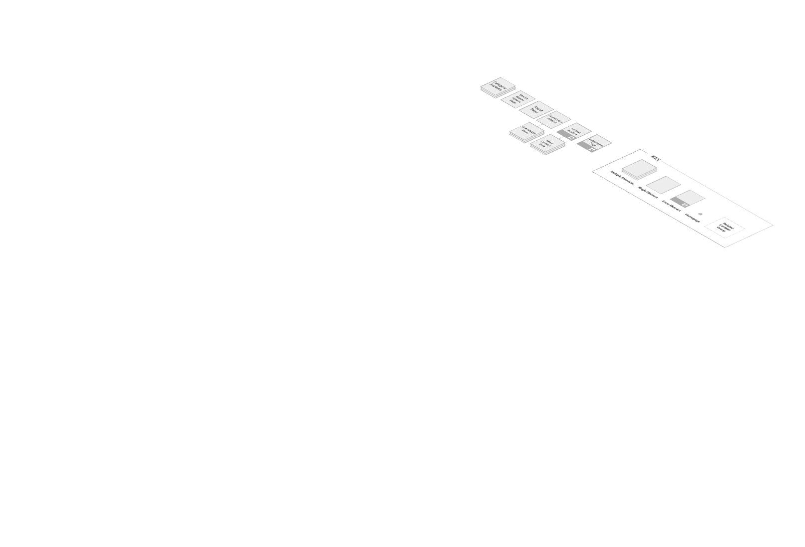
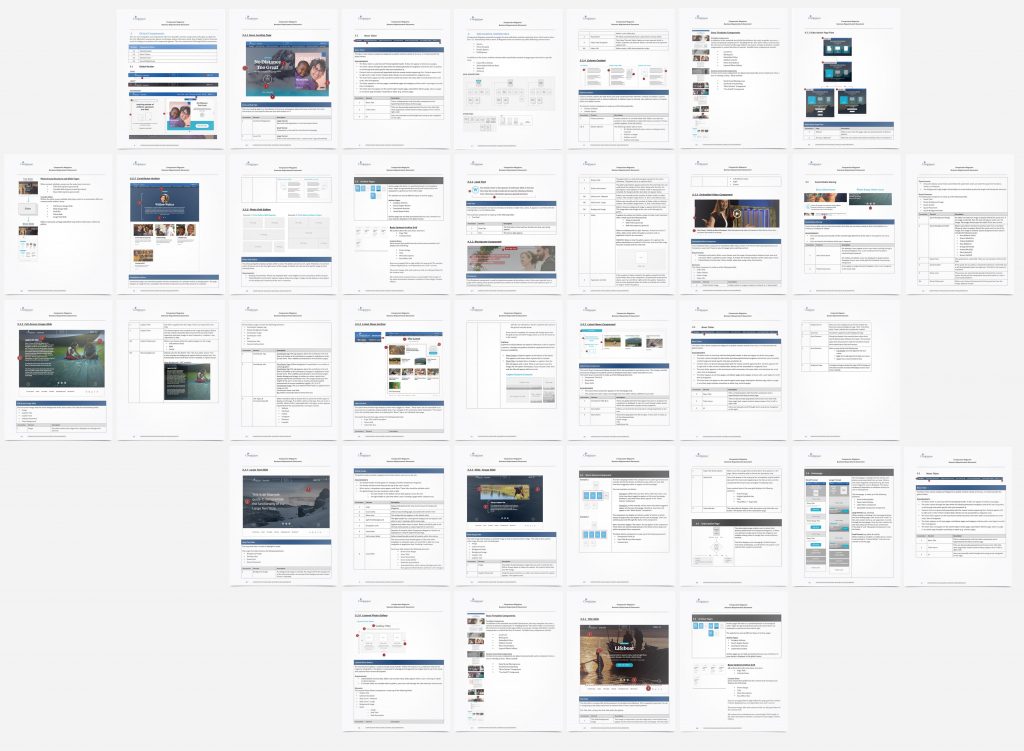
The new website was built on WordPress, but the IT department considered porting the site onto their in-house CMS, so they requested functional specs. I created a 60 page document that described in detail the site’s information architecture, functionality, appearance, and interactions with users.
Move to magnify
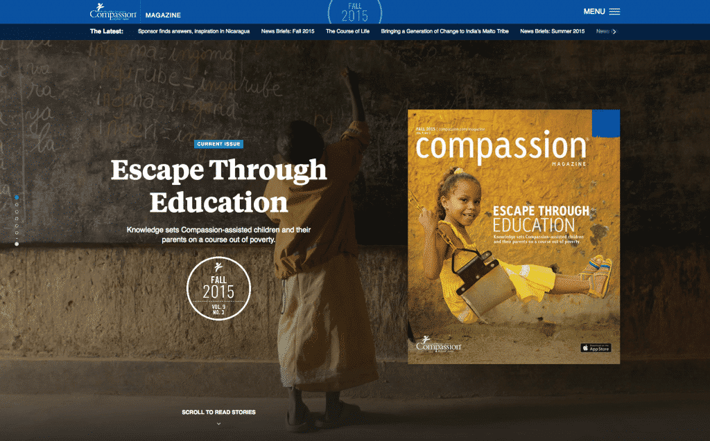
01.
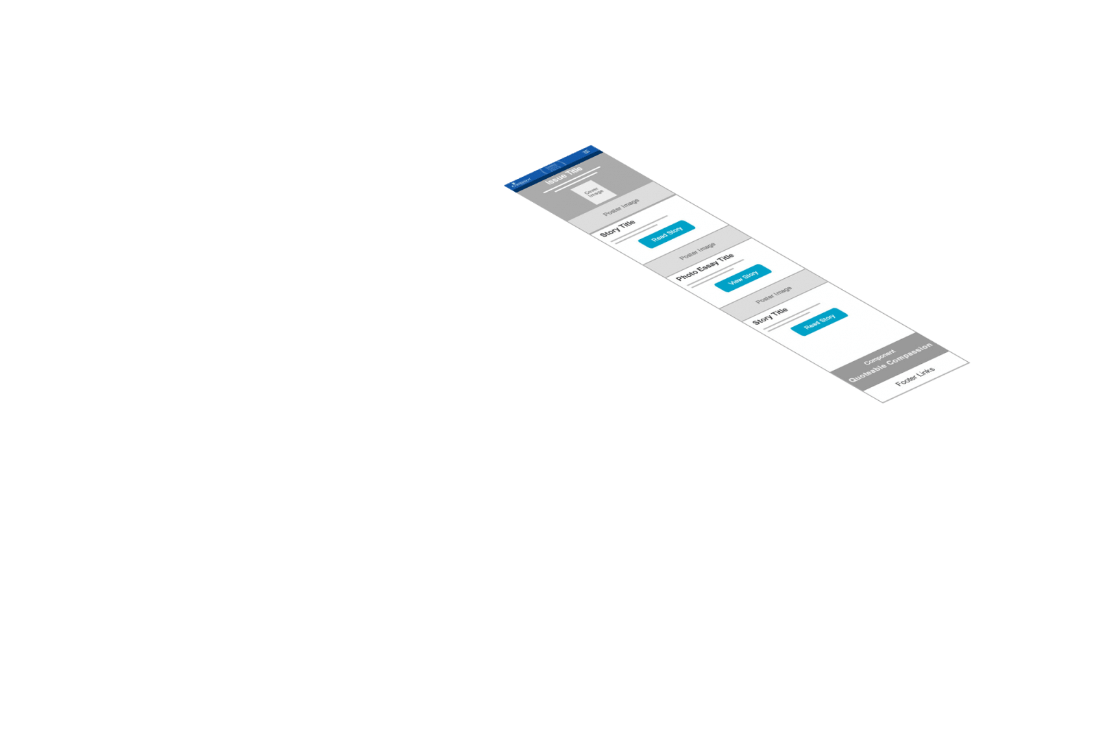
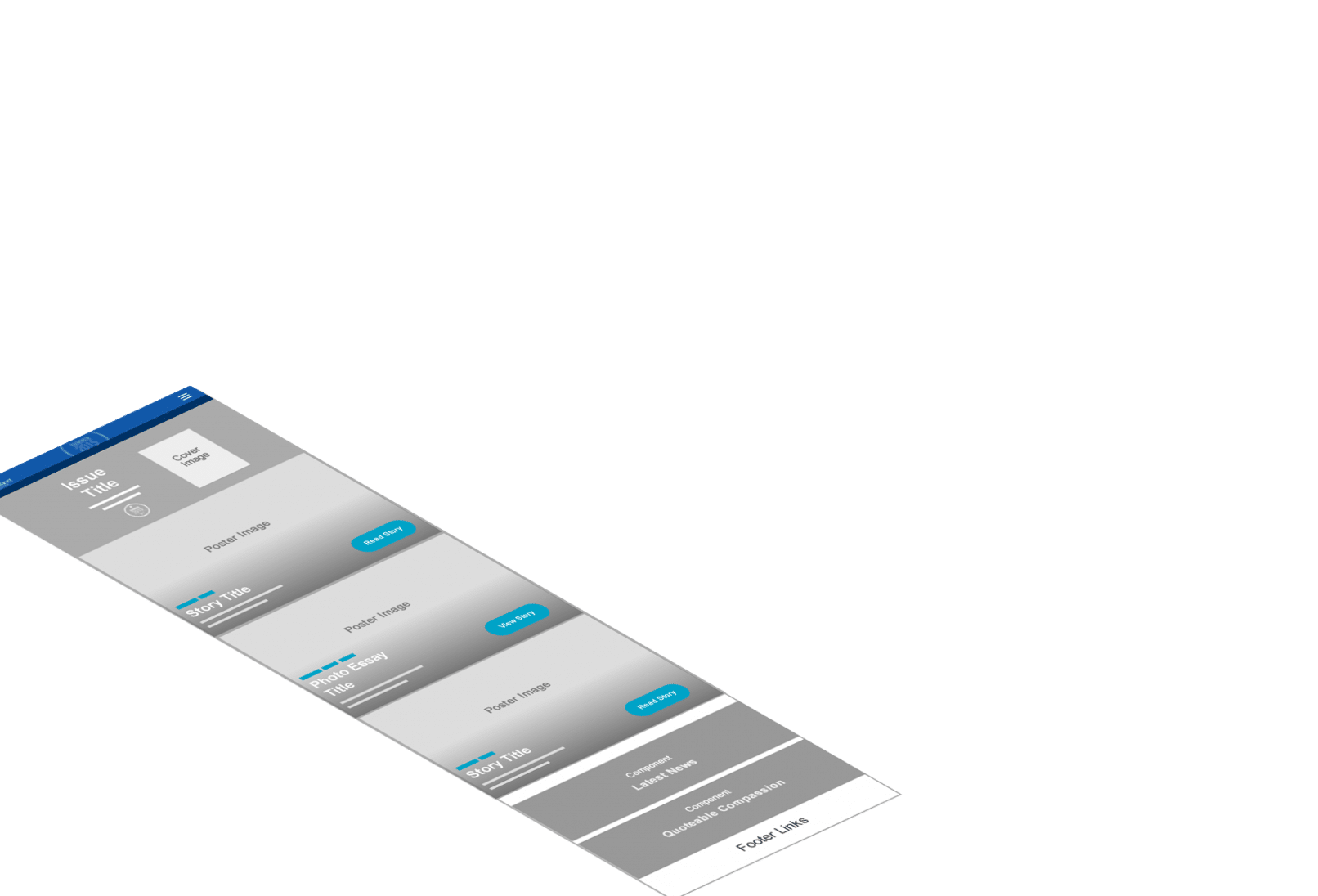
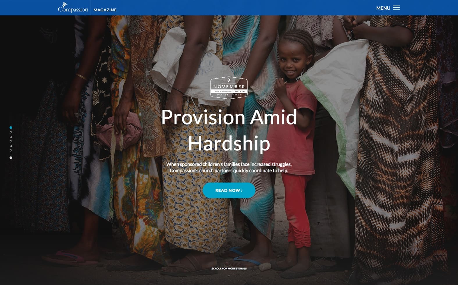
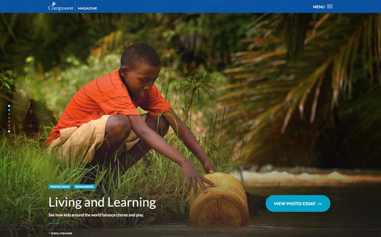
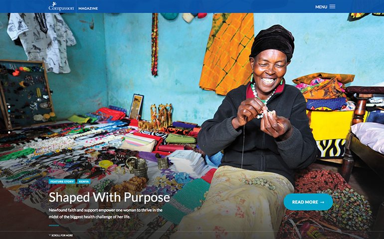
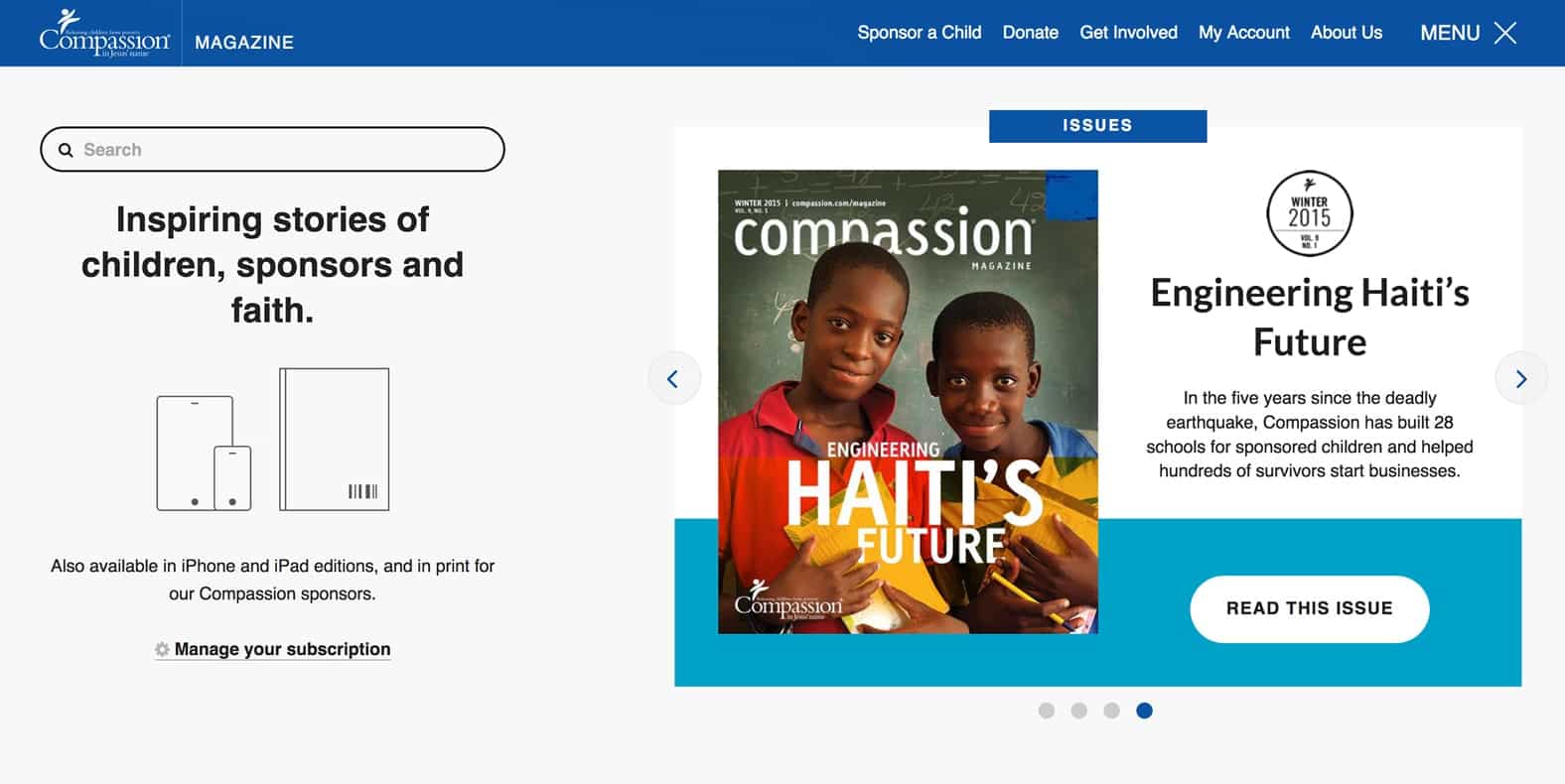
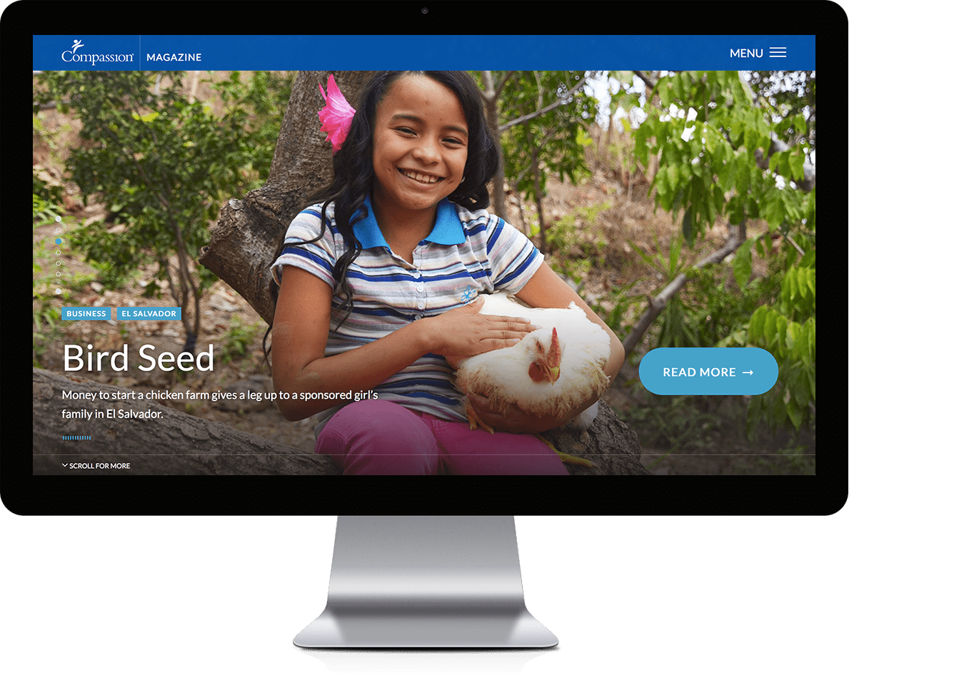
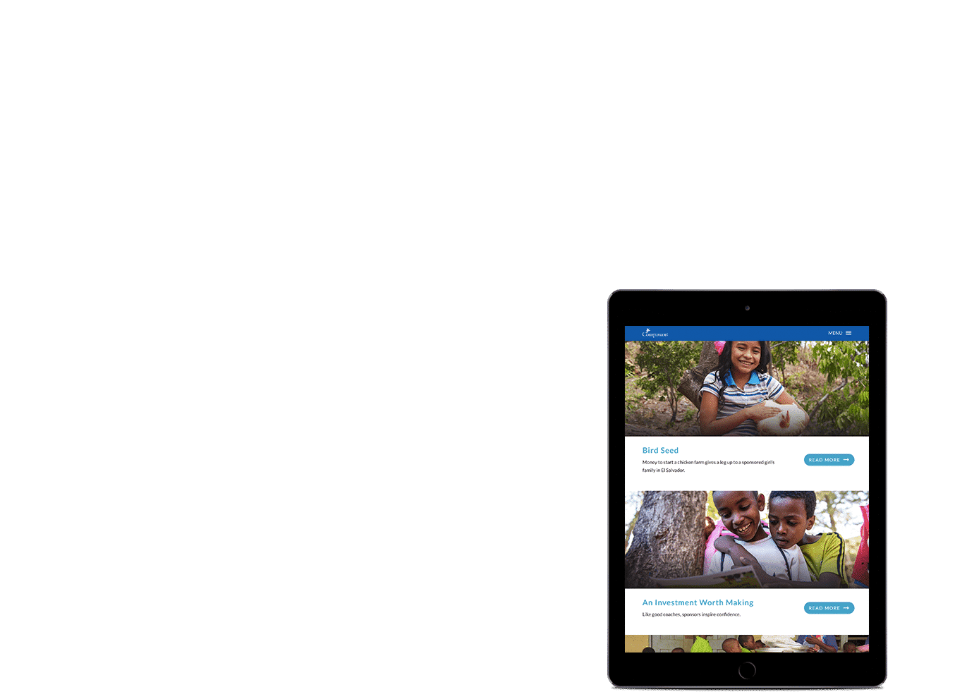
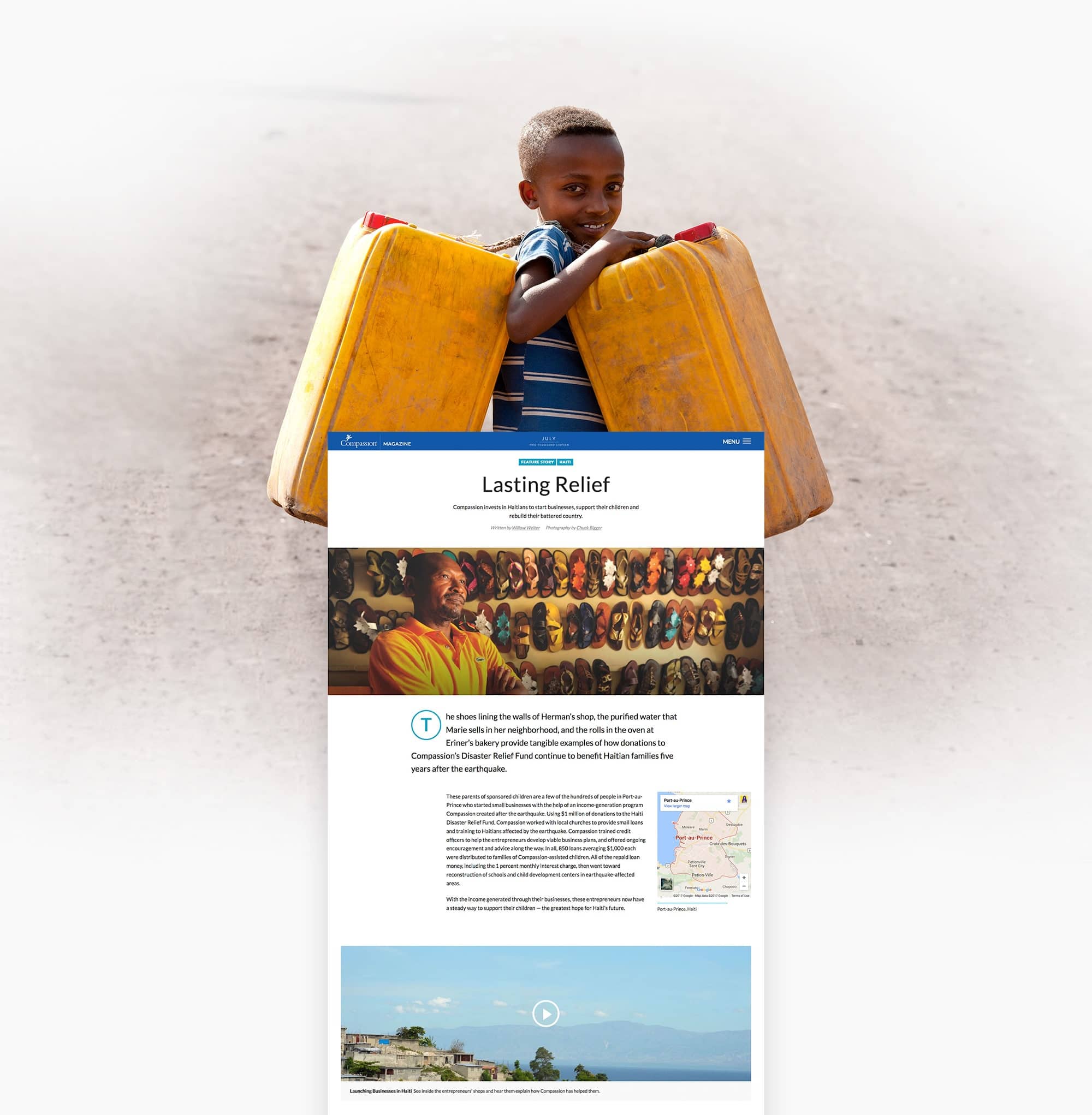
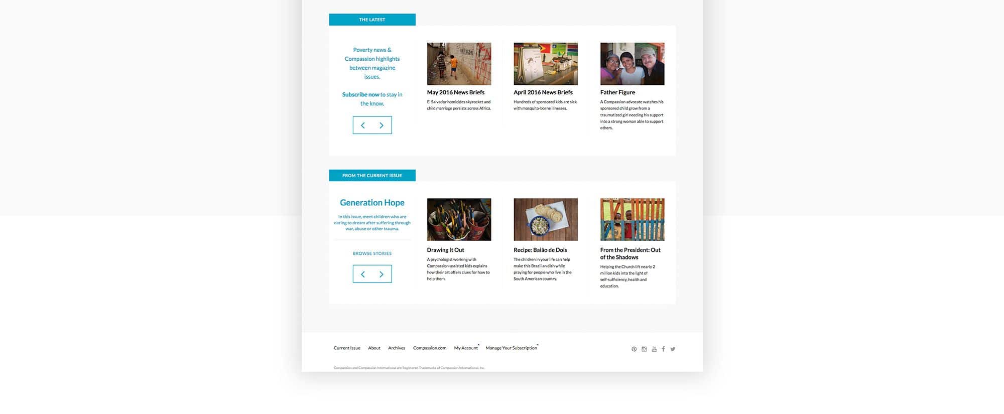
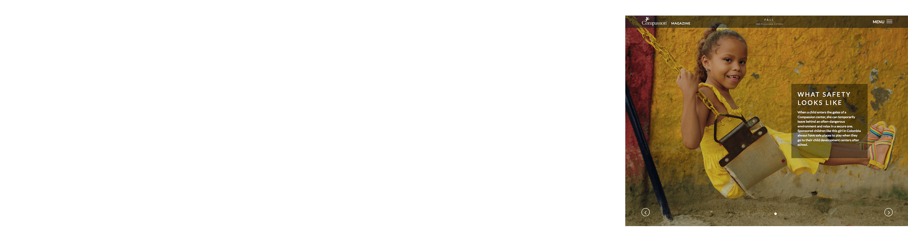
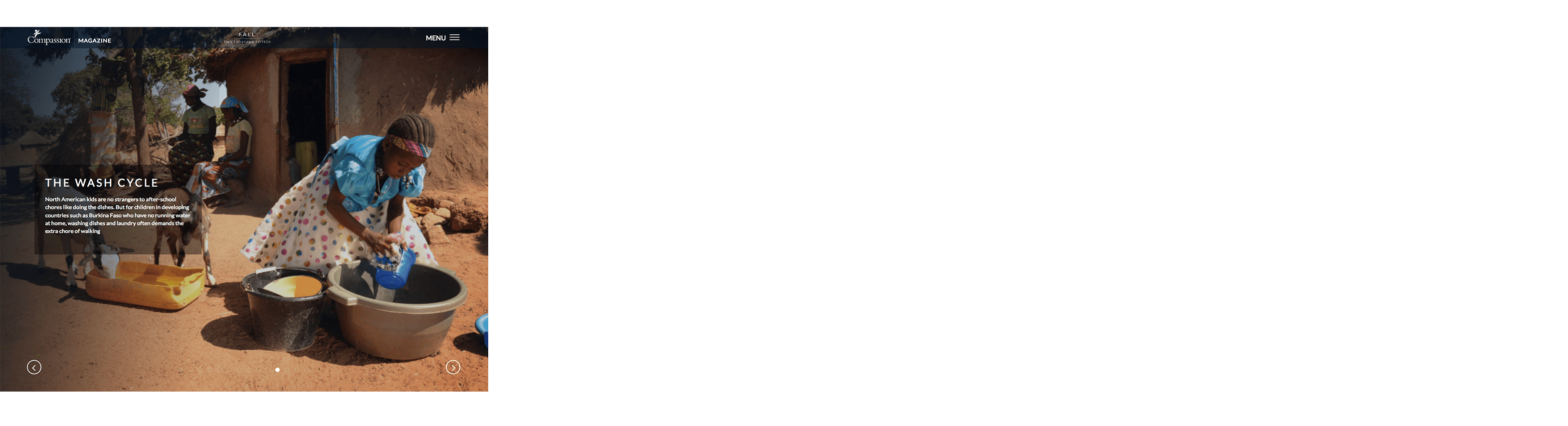
A New Homepage
The new homepage led with bold, poster-like imagery using full-screen scrollcards, and a dropdown menu gave users easy access to previous issues. I managed the website publishing cycle and made updates to the design post-launch based on user testing results.

02.
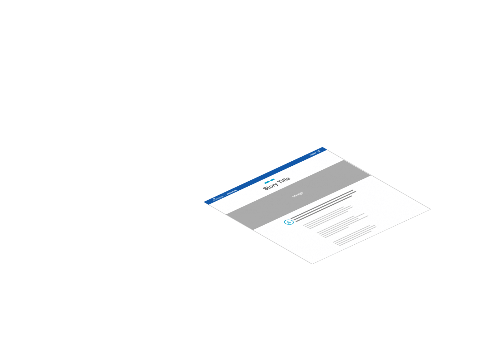
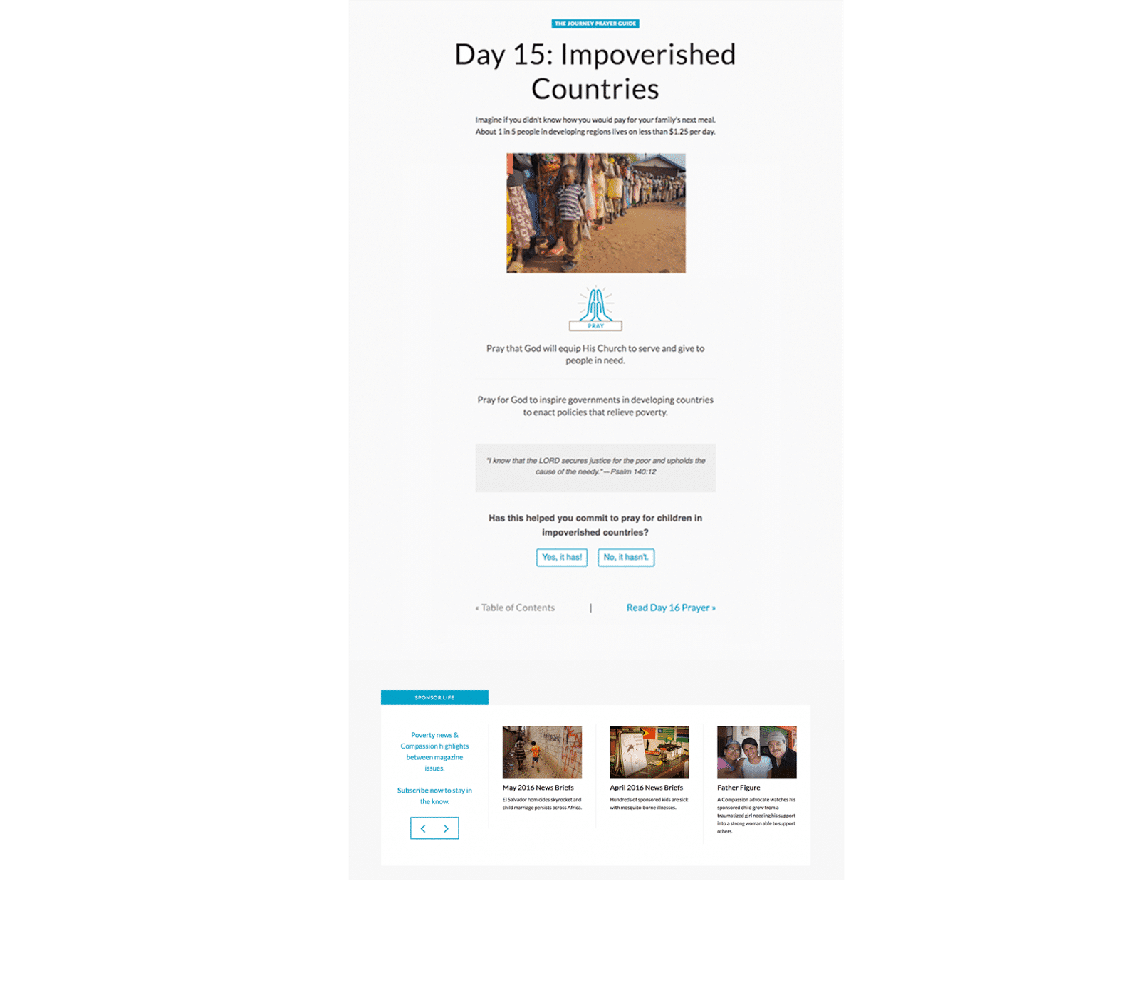
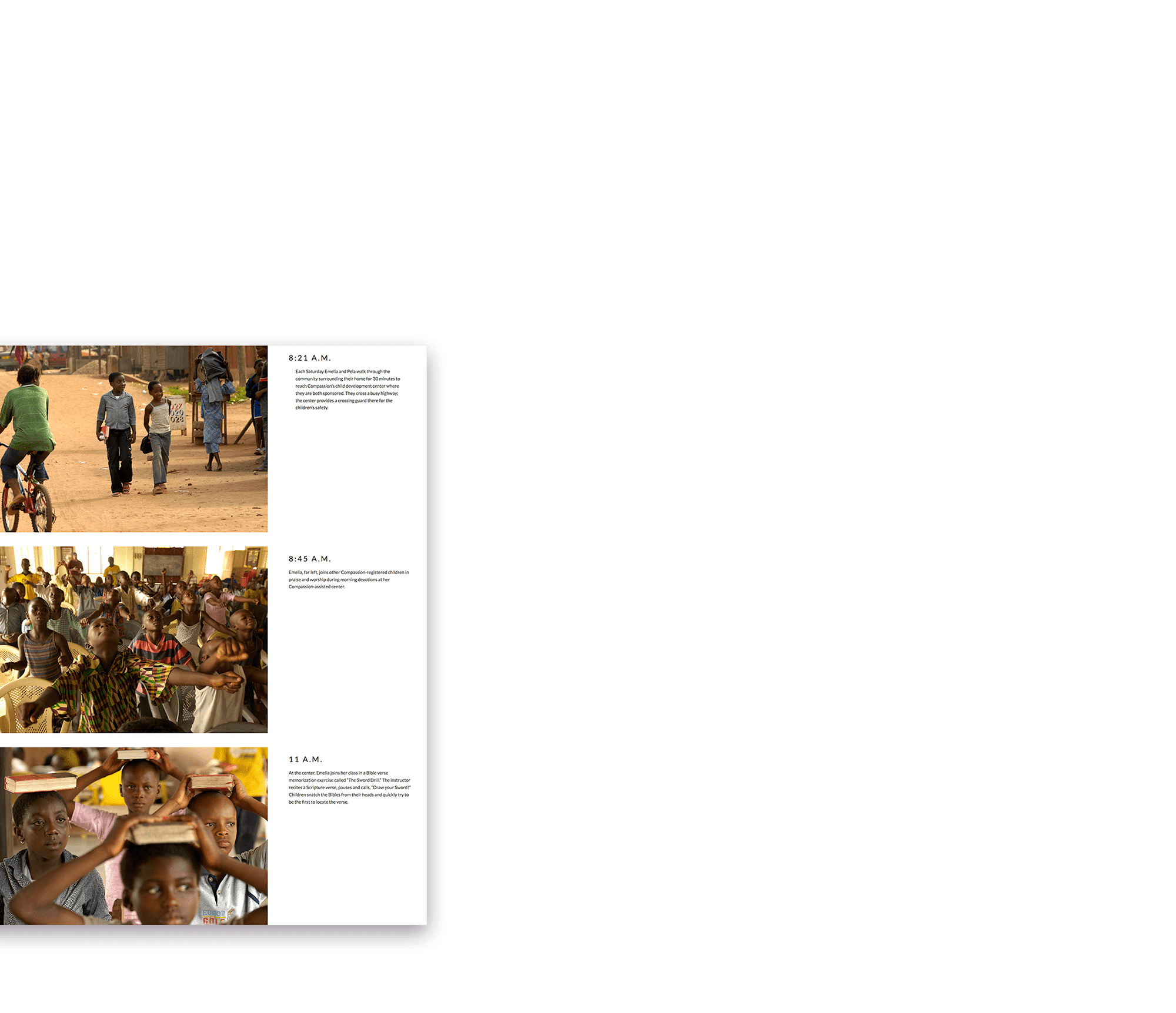
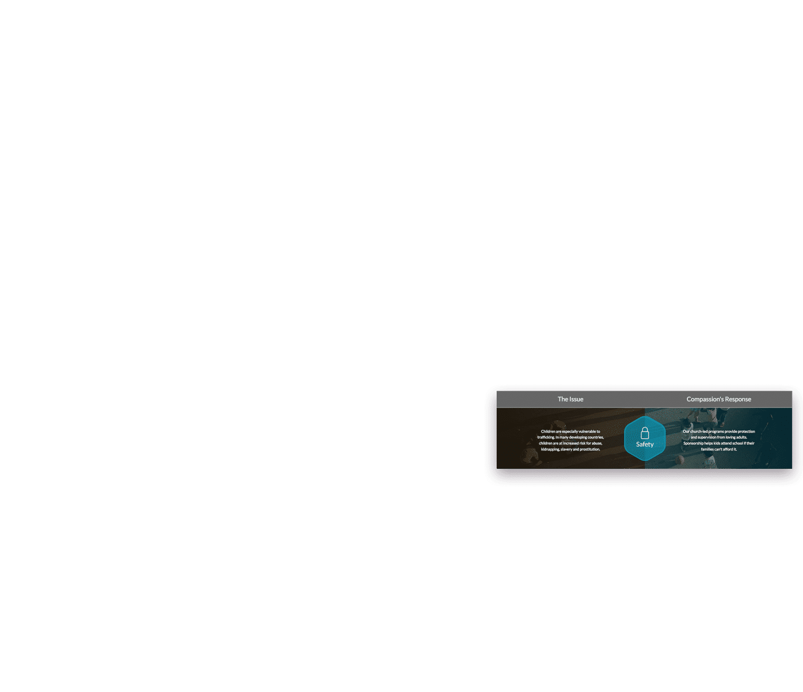
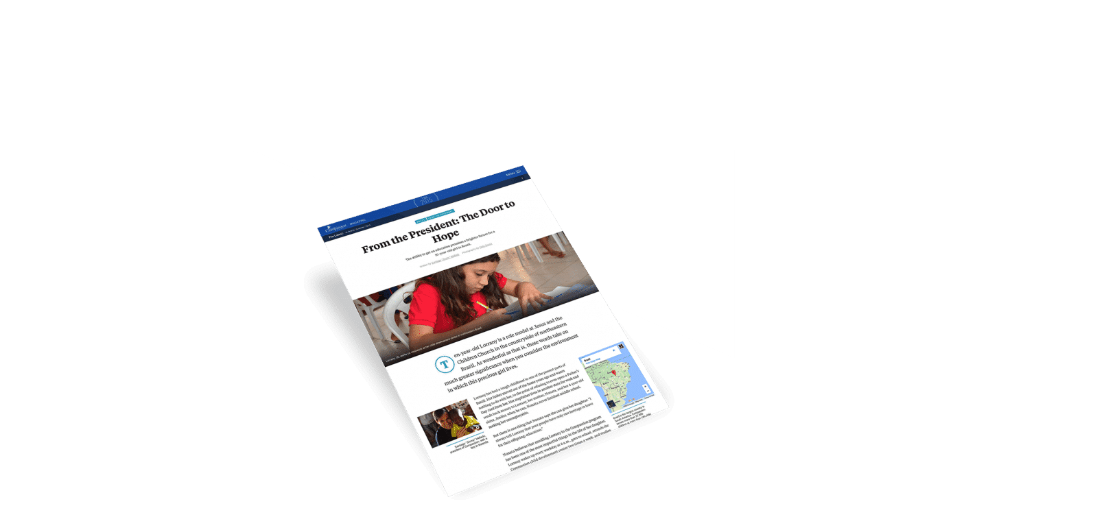
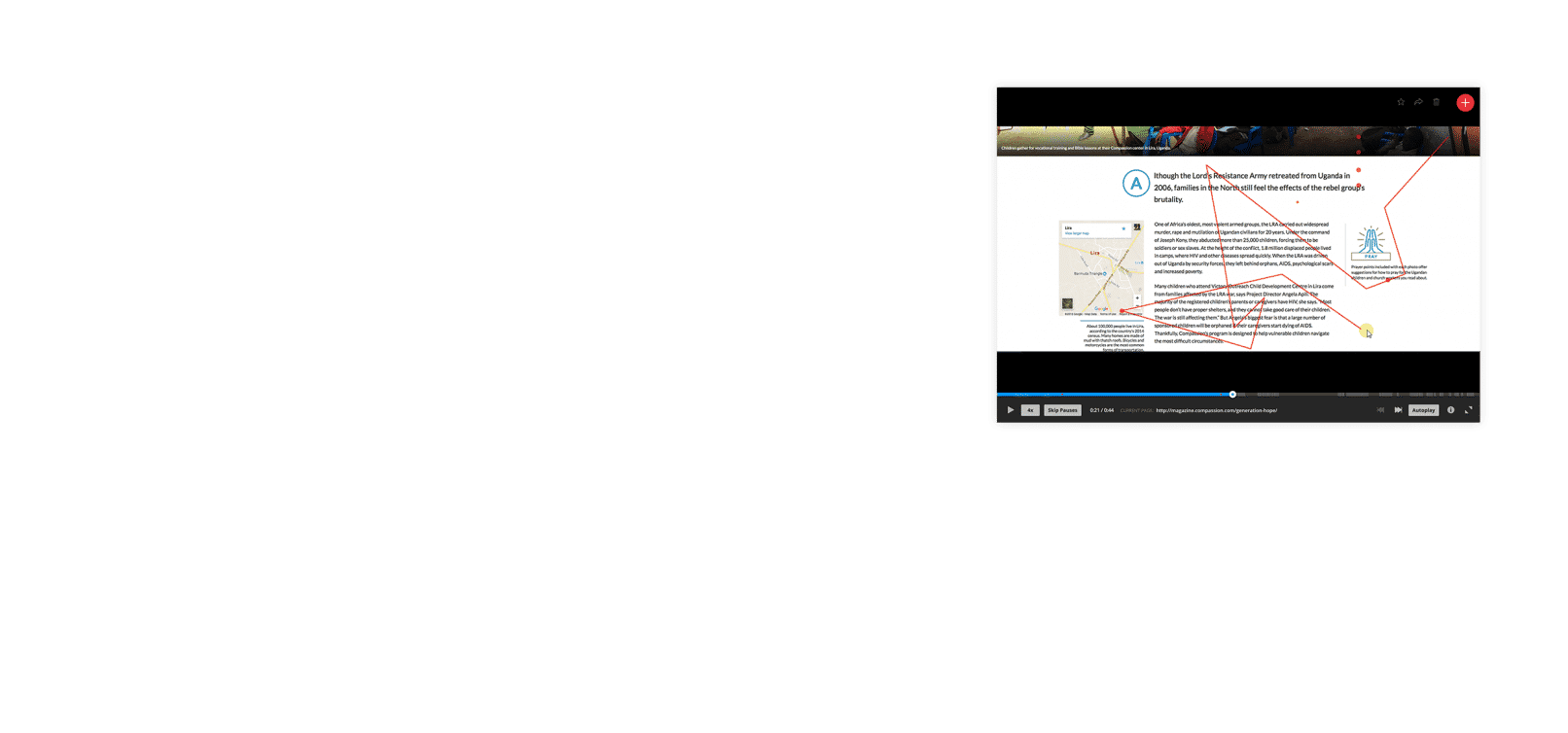
Visual Storytelling
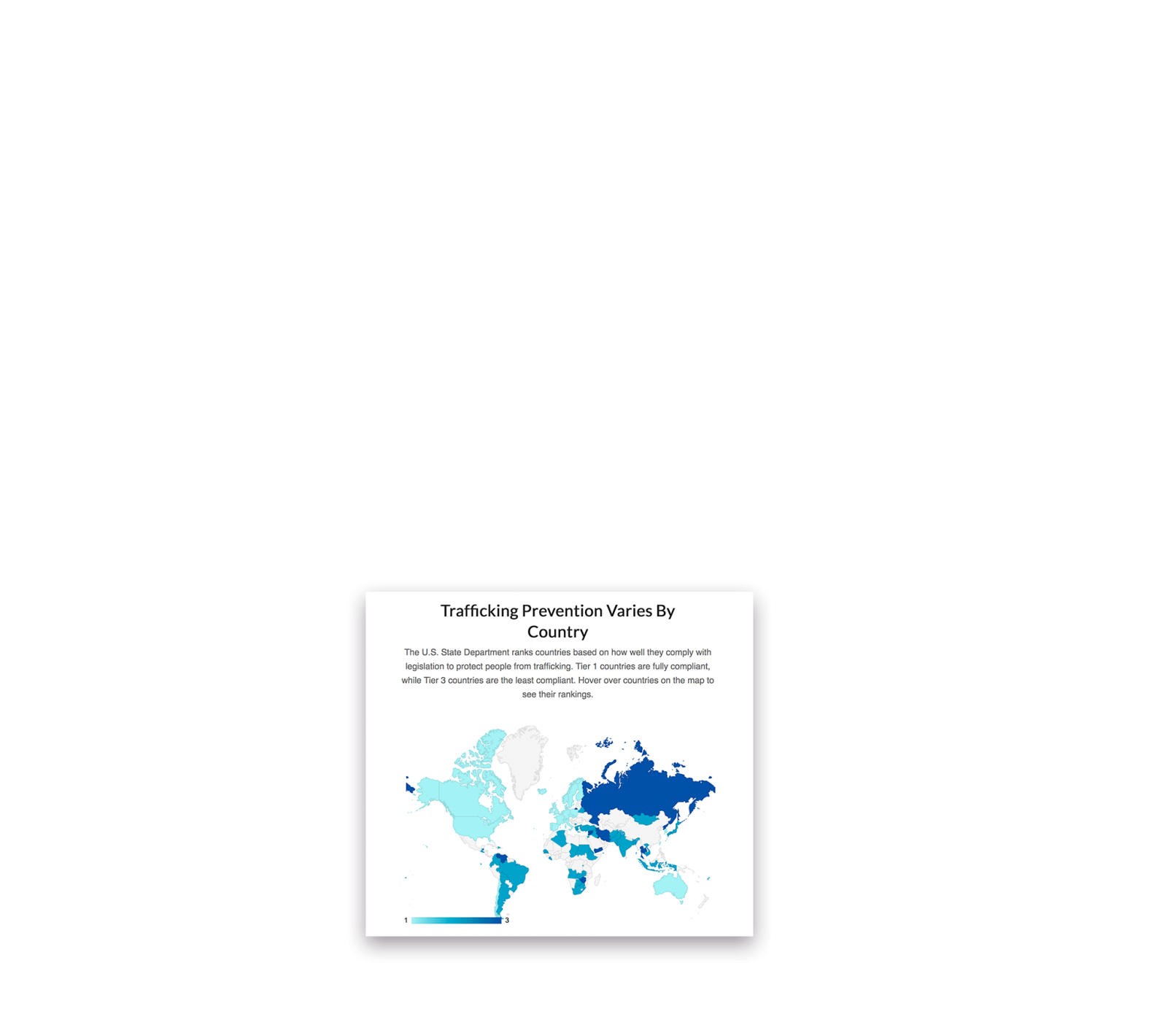
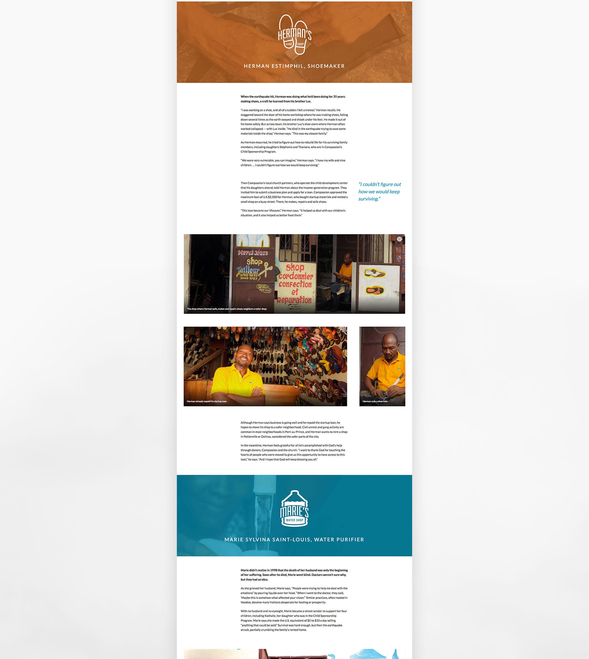
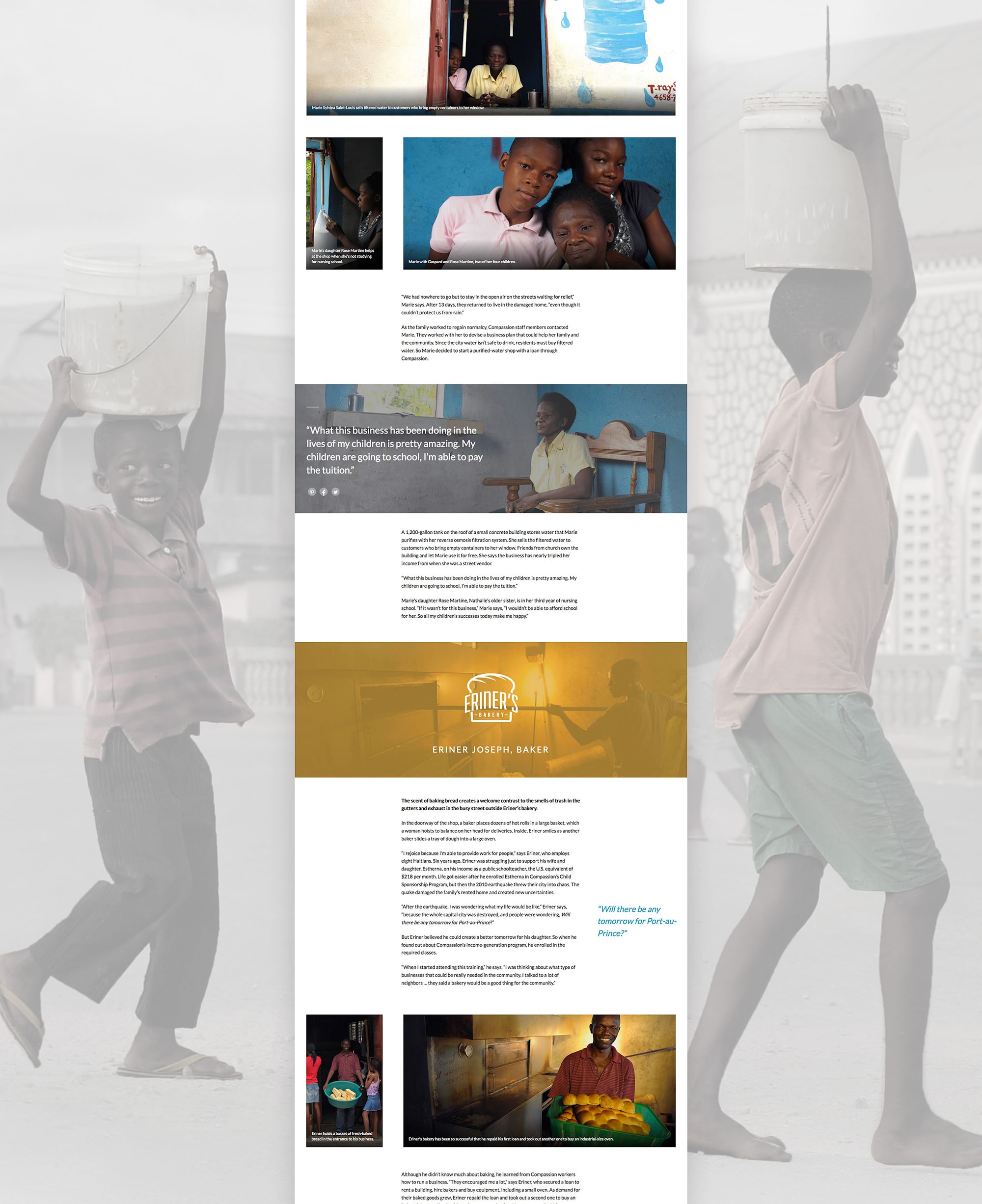
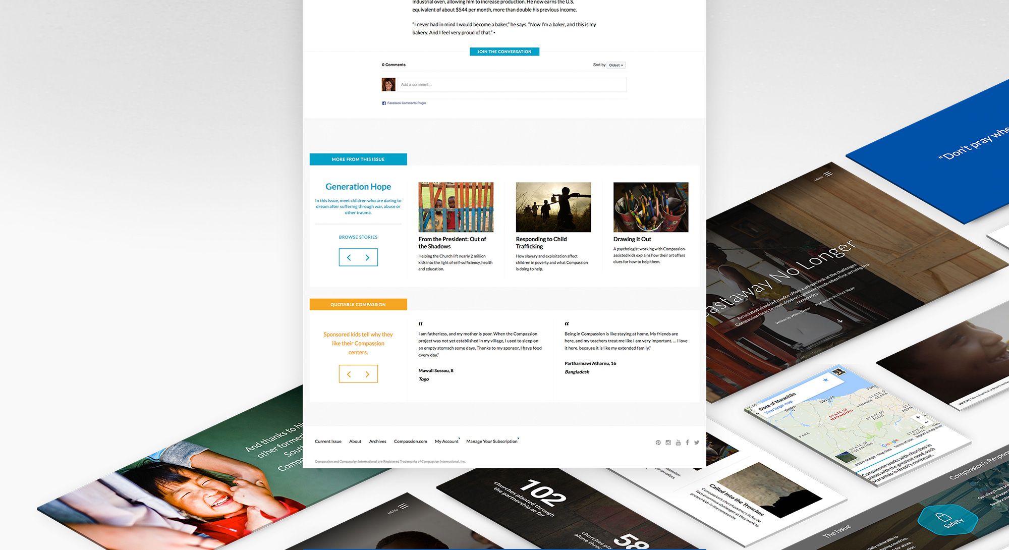
Compassion Magazine stories come jam-packed with extras, whether it be photo essays, salient statistics, country maps or actionable prayer points. These components really enriched a story by giving them greater context and giving sponsors ideas on how to act on what they just read. I brought this interactivity online by updating templates and story components to fit the Magazine’s publishing strategy. I also created new elements that were designed to work on their own or in combination with one another, to tell mini-stories and enhance the stories they appeared within.


03.
An Updated Styleguide
Working with the print magazine designer, I updated the site after the print magazine underwent a major overhaul post-launch and documented the styles in a web styleguide.


04.
Always improving
After the redesign, my work was not done. I used analytics, heatmaps, online surveys and user testing to keep a constant pulse on the site and make design recommendations. This helped us optimize how readers engaged with the content and measured the magazine’s impact as a retention and engagement tool.


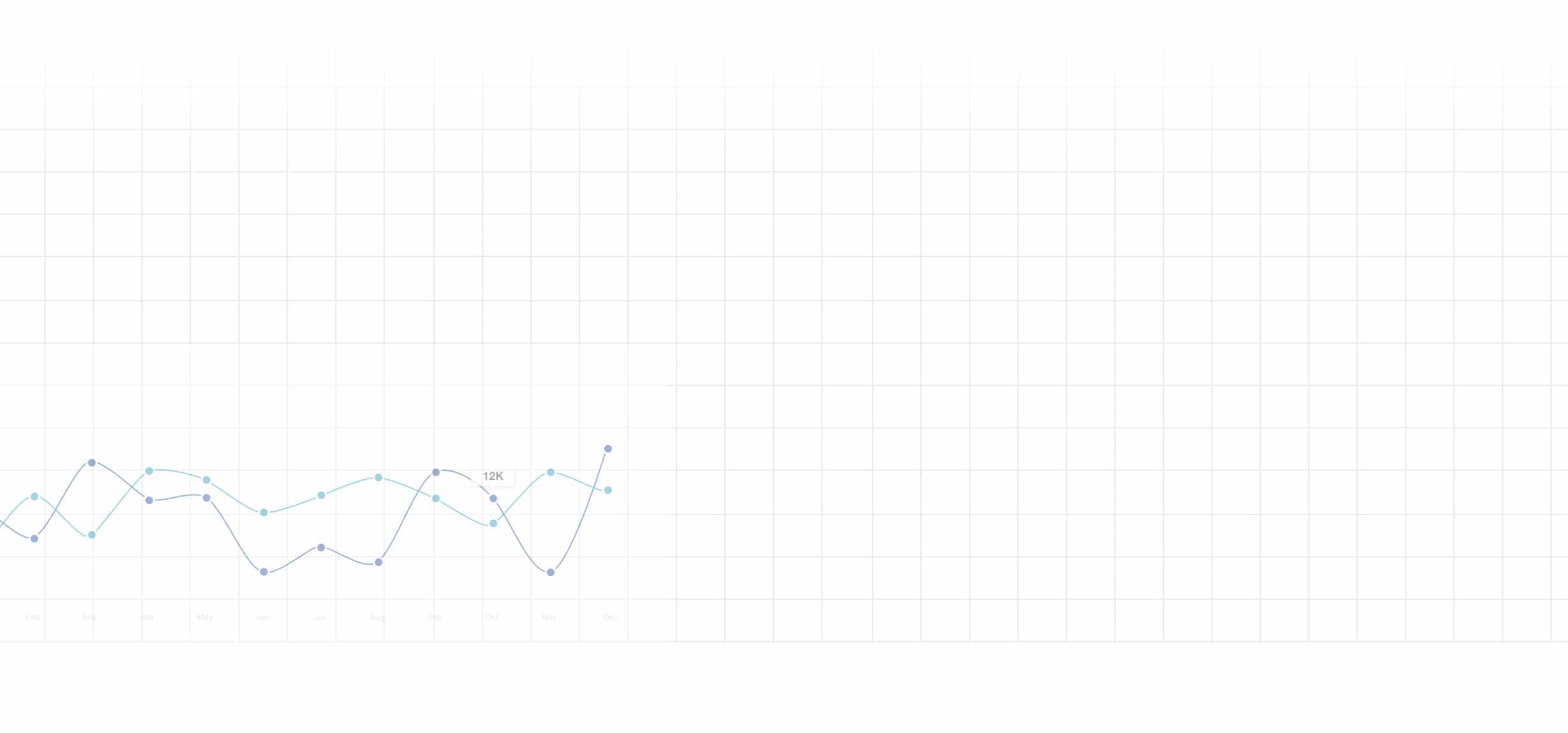
Example of how analytics informed design
Challenge
When the site first launched, the homepage featured a static magazine cover and issue description; users had to scroll before they could actually click into any featured content. Analytics revealed that readers struggled with this concept of the homepage scroll, and six months after launch the bounce rate was 57%.
Solution
I updated the design and replaced the issue cover with a feature story. Readers could now click straight into content when visiting the homepage. I also moved the scrolling ticker content to a scrollcard below the feature story. This removed distractions and gave users a clear pathway into our best content first.
Results
A month after the update, the homepage bounce rate dropped to 39%. Analytics also revealed that readers spent more time on a page and clicked into additional content once they started their sessions with a feature story.
Before
After

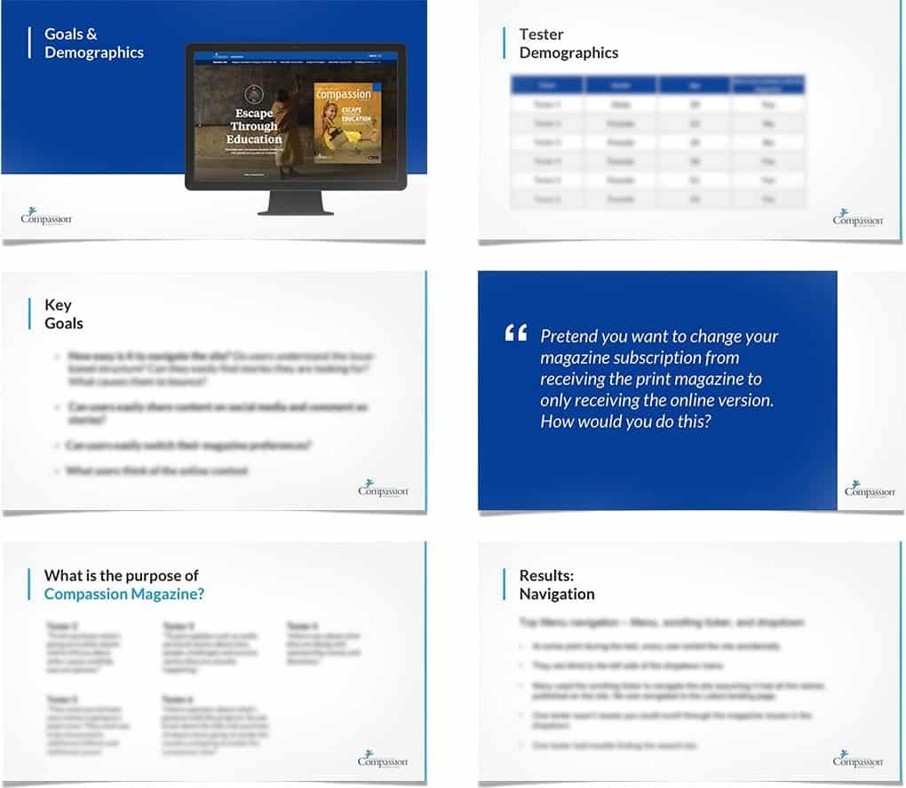
Putting it to the test
I partnered with a marketing firm to conduct in-person user testing. I wrote the test script scenarios and documented the post-test results, presenting it to the team.
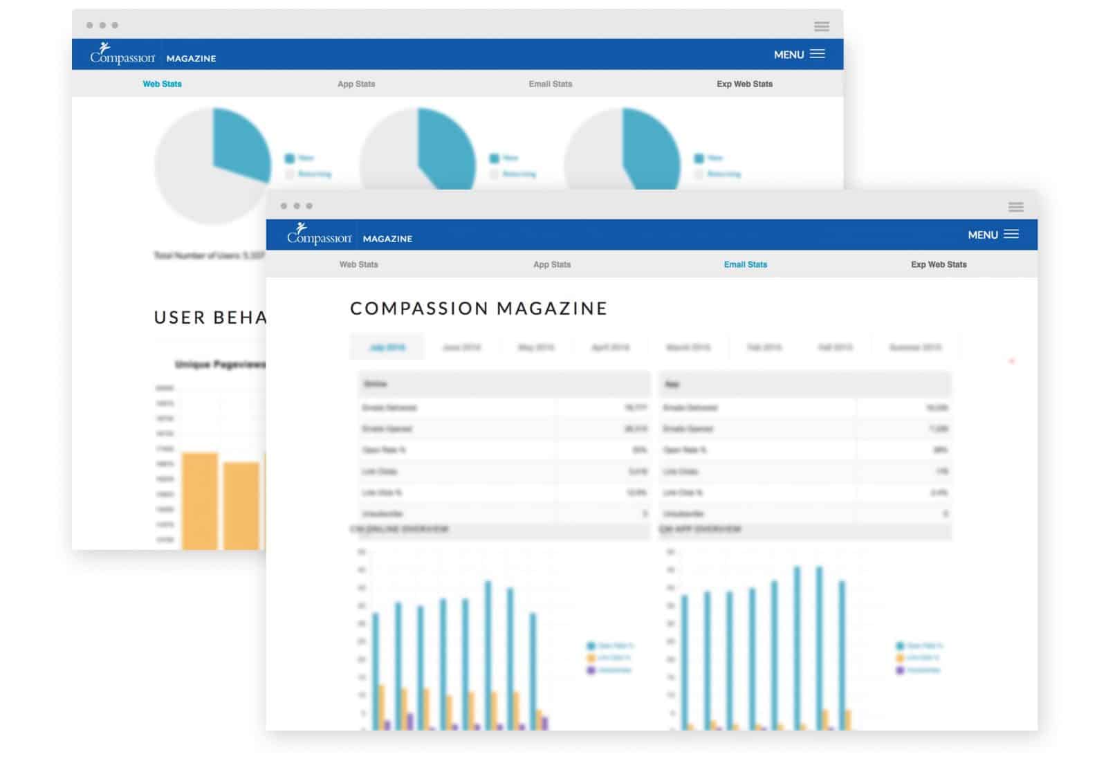
Data dashboards
I also built online dashboards that allowed upper management to see the month-to-month trends and statistics for all the magazine’s digital properties and measure their email open rate performance.

![]() Like what you see?
Let's Talk
Like what you see?
Let's Talk