Role:
User experience, Prototyping, Branding, Visual design, E-commerce
Year:
2011
The National Strength and Conditioning Association (NSCA) is the world’s leading organization in the field of sport conditioning. In 2011, they decided to completely redesign their entire website, overhauling their content management system, e-commerce, online learning and user accounts.
With the help of their brilliant in-house content strategist, I reimagined the entire NSCA digital ecosystem giving the NSCA a strong digital presence that reflected the spirit of the organization.
Embracing the user
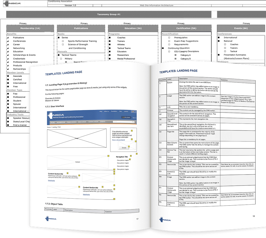
When I came onboard, the NSCA had already done their homework. After doing a complete audience analysis, they knew they needed to communicate better with the coaches, instructors and students who regularly visited the site. They needed to completely overhaul their content taxonomy to create a better approach and underlying system for relating and structuring this material.
From these conversations, the content strategist and I rethought the information architecture and produced wireframes that supported the new content structure.
Bringing an idea to life
Using the taxonomy and audience analysis research, an interactive prototype was created to put intended user flows to the test and make sure the design and content would co-exist happily together. While not aesthetically beautiful, the prototype helped clarify functionality and allowed us to move onto the next phase of the design to concentrate bringing the experience to life visually without worrying about what should or shouldn’t be on the page.

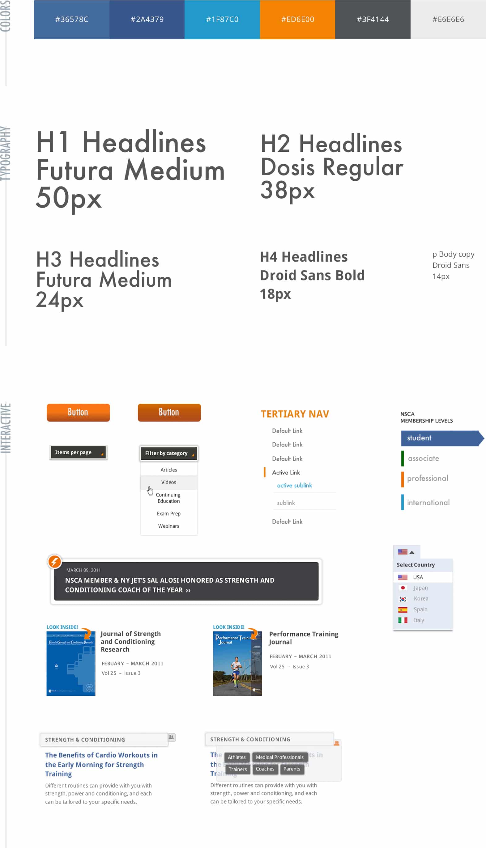
A bold and flexible design language
The old NSCA website didn’t reflect the modern, bold aesthetics of the organization. To get the new look dialed in, I met with the NSCA directors to discuss how to translate the brand online. From these conversations, I created a styleguide for their online presence that could easily be scaled across templates. This served as a benchmark for the design moving forward.
Final Designs
After weeks of meetings and discussion, I delivered final designs for every page, every component and every interactive element—all down to a pixel perfect hand-off to the development team.
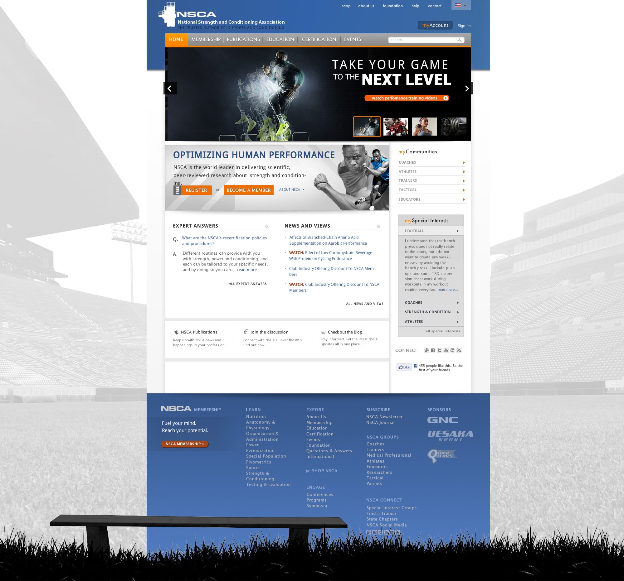
A new homepage hub
The new homepage put audience-specific content up-front and users could personalize what they saw.
Content is king
At its core, the NSCA is an educational institution and has thousands of pages of content with over a dozen different content types. The new design was flexible enough to support their vast content needs while faithfully representing the brand across a variety of templates.
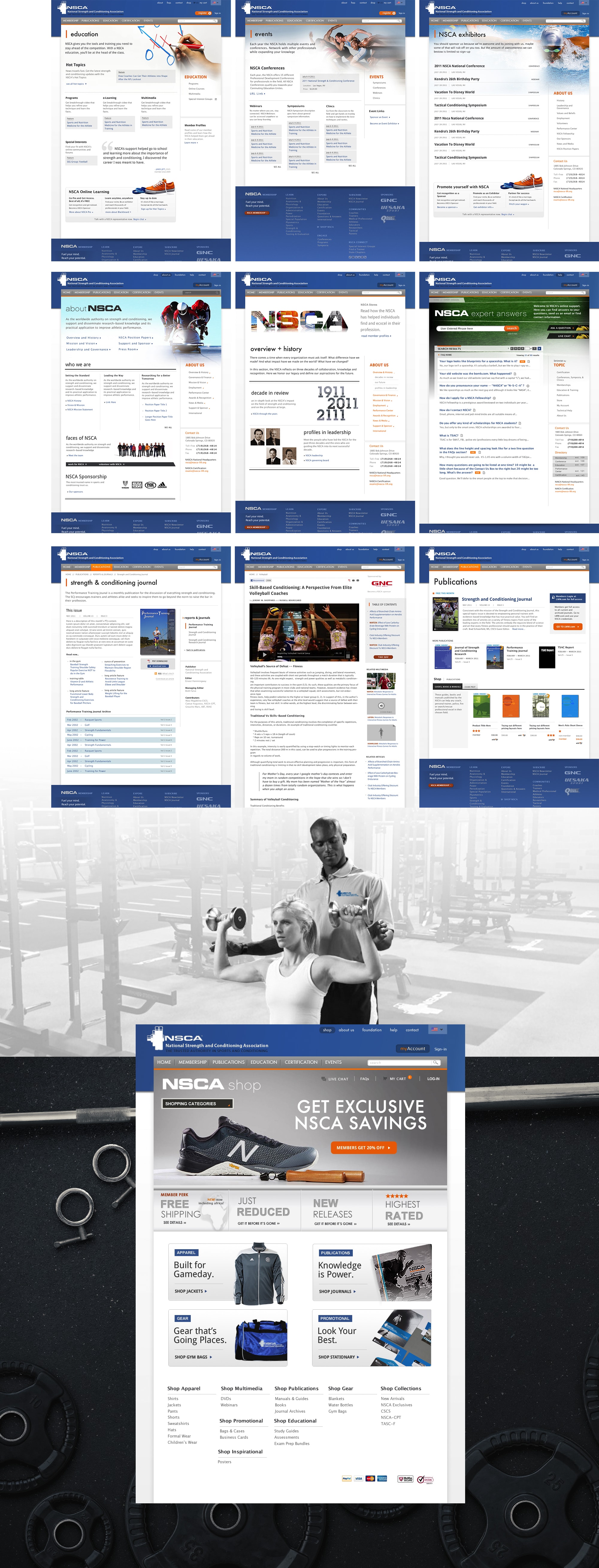
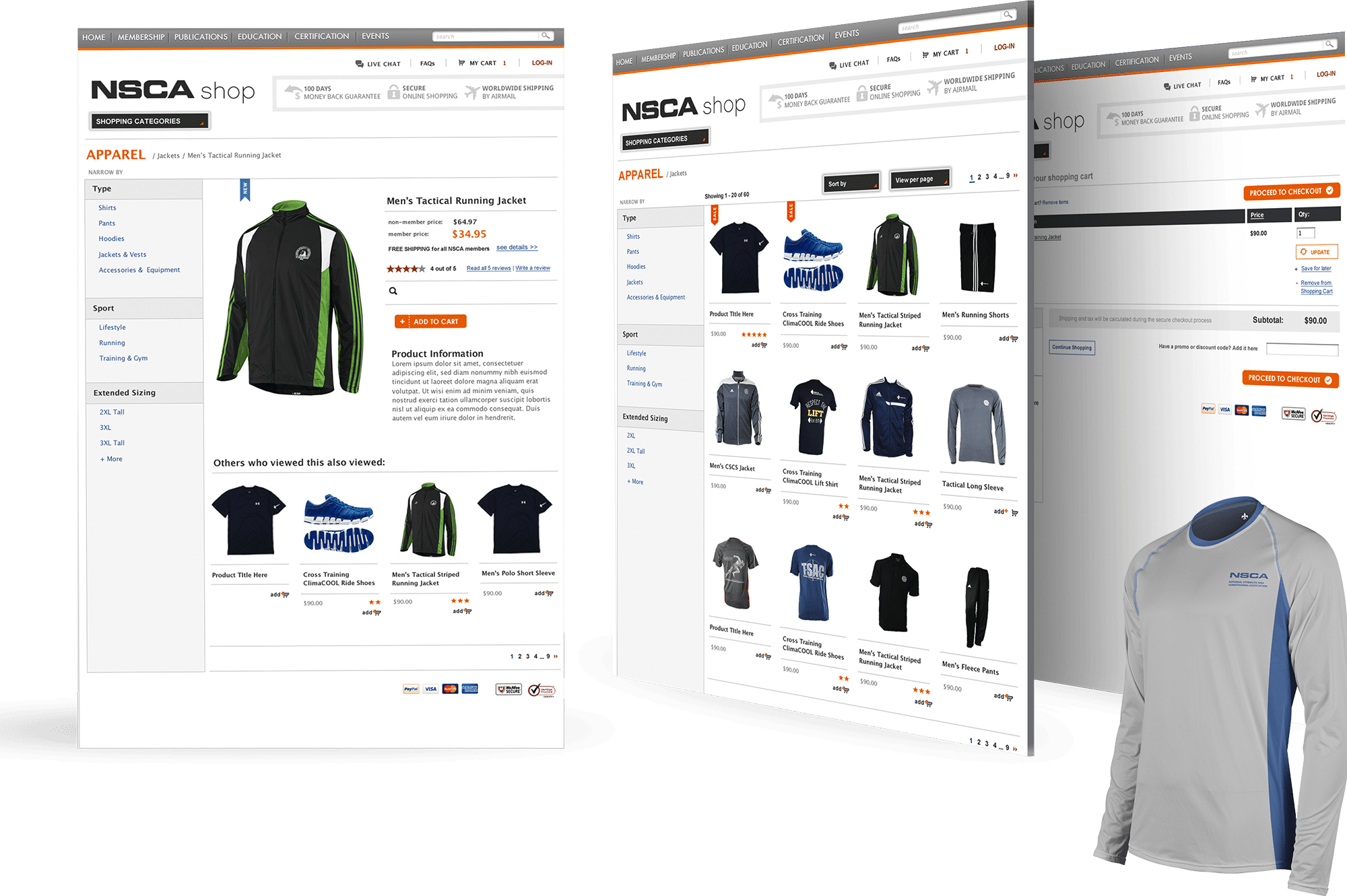
Make shopping simple
A totally redesigned shopping experience removed clutter while putting products at the forefront. The design is simple, clear and intuitive – highlighting the NSCA’s products and publications.
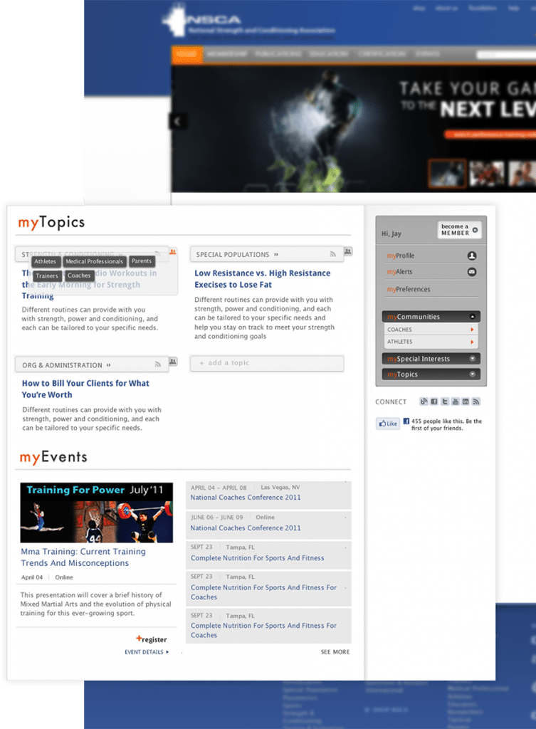
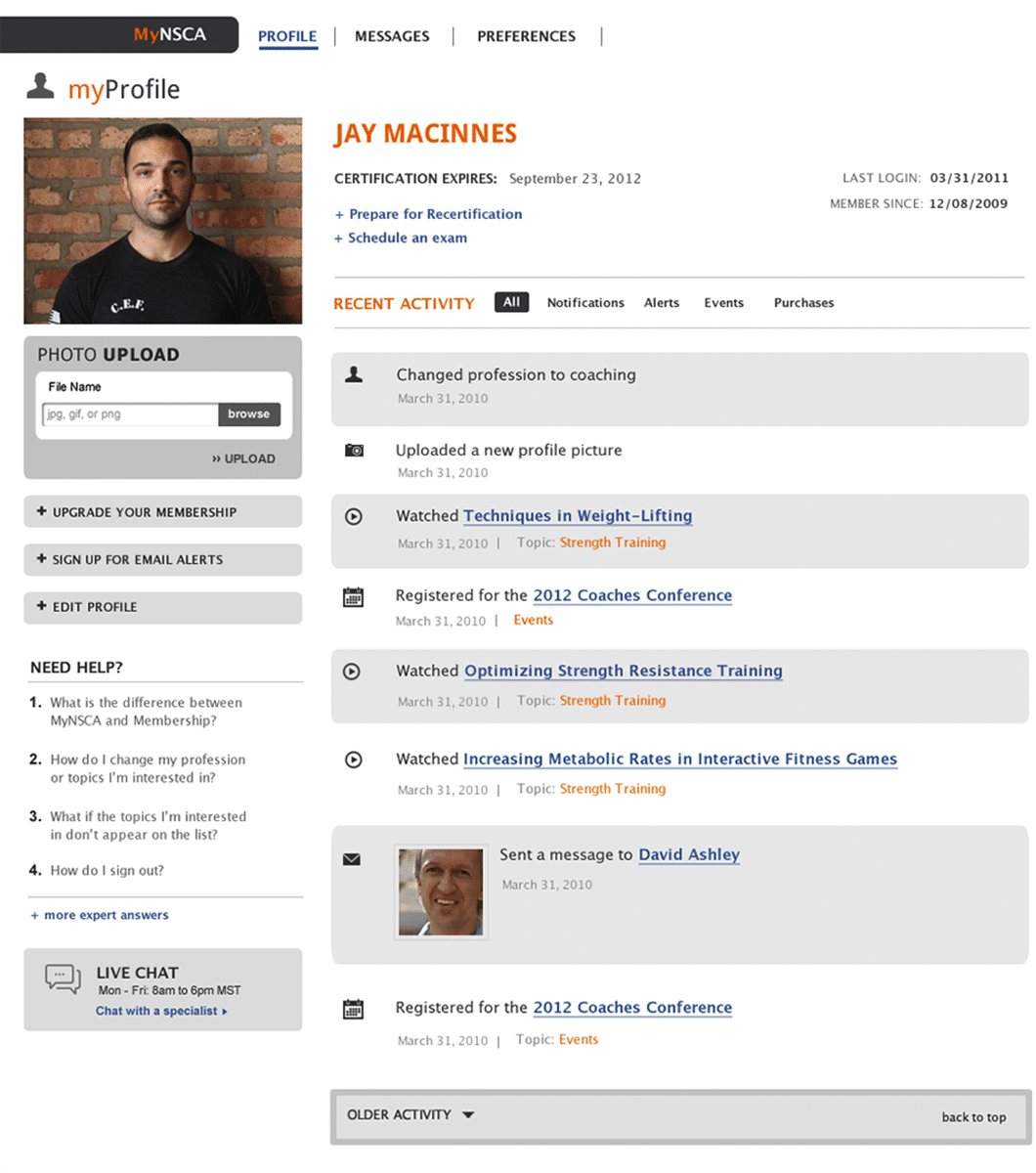
Getting personal(ized)
Users can now manage their NSCA memberships with a completely redesigned dashboard that puts notifications and account activity up-front.
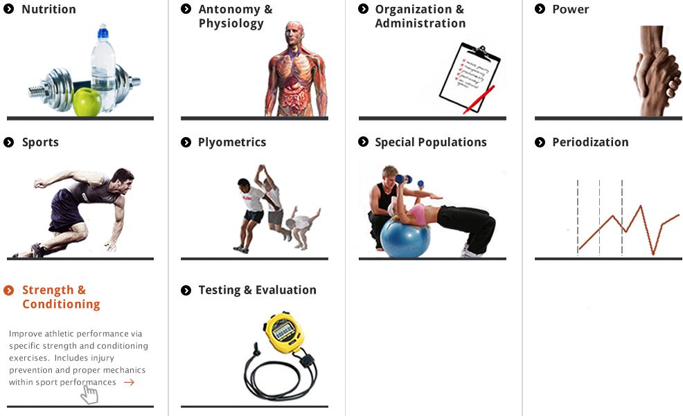
Encouraging exploration
The user-centered approach to design meant content was reorganized and prioritized so users could more easily find what they were looking for. The new taxonomy structure meant content could be tagged and presented in a variety of ways the old site had never allowed.
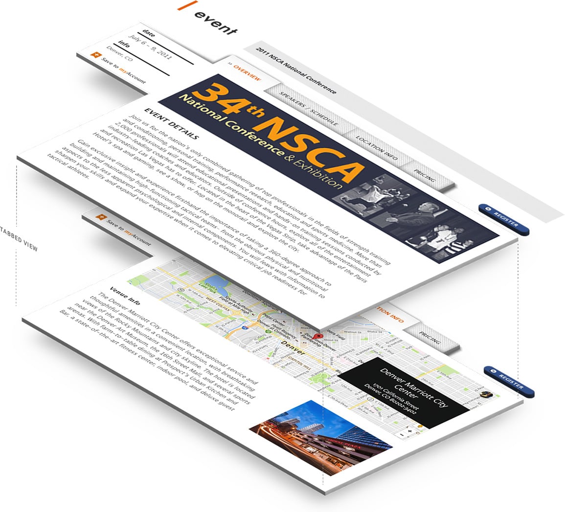
Browse events
Core to the NSCA are the multiple conferences and trainings it holds every year. Lectures, symposiums and other event information are now presented in a manner that inspires users to take advantage of the NSCA’s numerous educational opportunities.
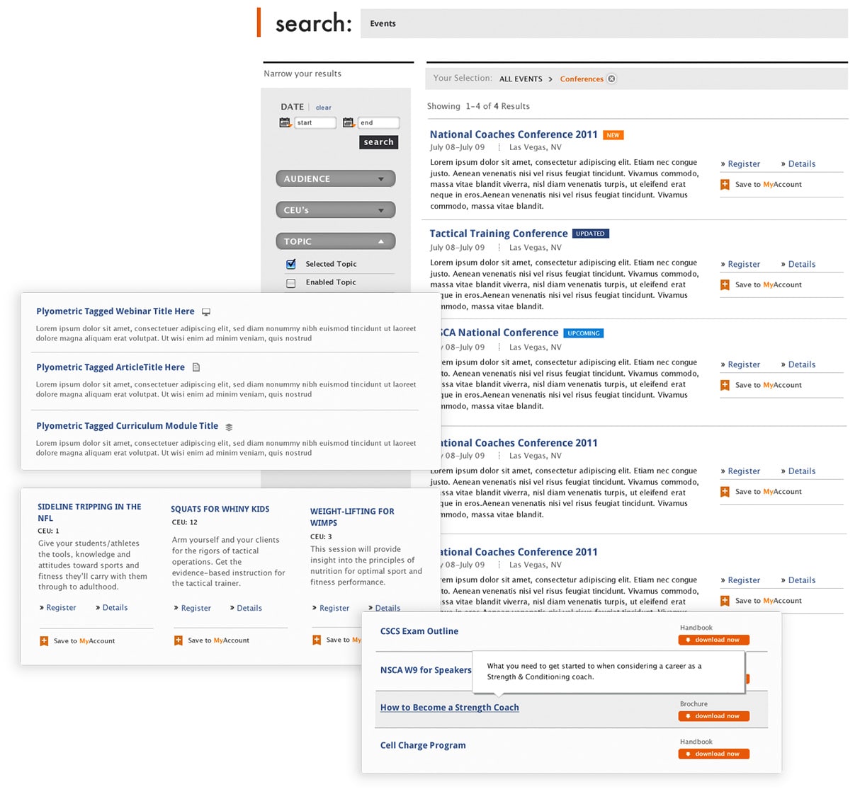
Easier search and filtering
Simple filtering helped users zero in on the right content. Within the archives, different content types were given different layouts and interactivity to encourage the user to take action.

![]() Like what you see?
Let's Talk
Like what you see?
Let's Talk