Role:

Web strategy, Information architecture, Wireframes
Year:
2014
FocusOnTheFamily.com was last redesigned in 2008. Since that time, the ministry’s content strategy had shifted over the years from providing expert opinions and tools for crisis response to becoming an engaging destination where people could access content to help their families thrive. However, the outdated architecture had locked the ministry into ‘article modules’, and it lacked common web features to allow for deep searching or cross channel promotions.
The goal was to lay the foundation for a flexible and reusable framework that could not only compete with other modern websites but also raise the profile of smaller web properties and initiatives.
By creating personas and conducting multiple rounds of card sorts and stakeholder interviews, myself and co-designer @jasonogle completely restructured the information architecture and presented a strategy to overhaul the site. The final designs accounted for both the users needs, the multiple stakeholder’s requirements, and the ministry’s technological restraints. Below are a few of the concepts and recommendations presented.
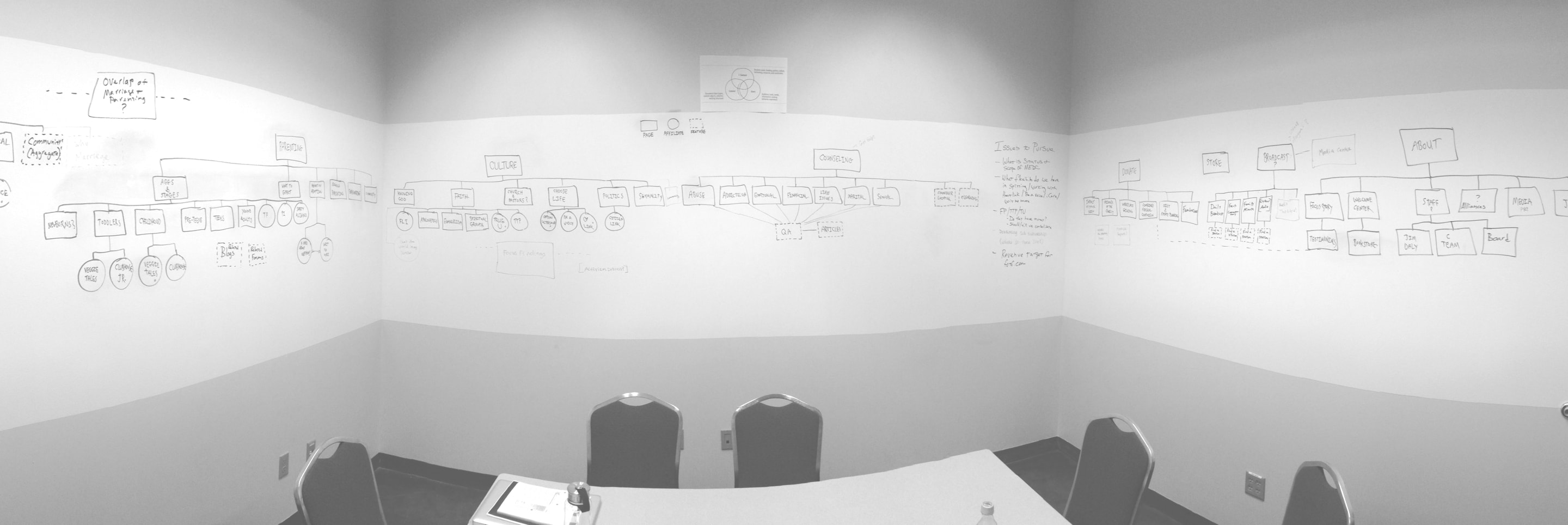
Creating Content ‘Hubs’
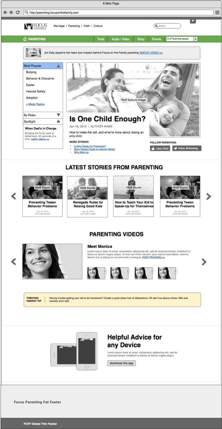
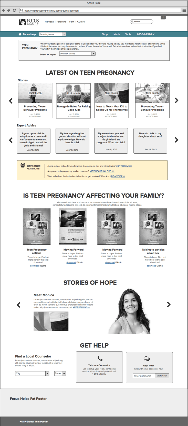
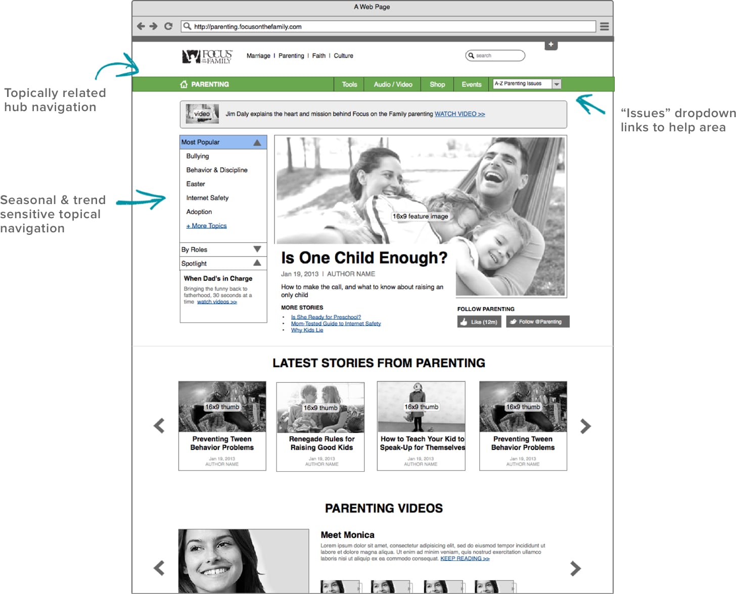
The new site uses robust templates to allow for “skinned” views across Focus on the Family’s individual channels (i.e. marriage, parenting, faith, etc). Each channel is a ‘hub’ of information and has its own content ecosystem of relevant navigation, promotions and color branding.
Using components, these pages can be fully customized outside of the template layout, enabling the site to flexibly support channel campaigns, media spends, and individual marketing needs.
Channel Color Schemes

Parenting Hub
Counseling Hub
Hub Close-up
FEATURES:
- Leverage brand colors: Each channel is its own “hub” of relevant content as indicated by brand color
- Use subdomains instead of subdirectories to promote consolidated brands within FOTF. This also promotes high-level areas of the site and helps them compete individually with competitors (parenting.focusonthefamily.com marriage.focusonthefamily.com)
Filtered Content Archives
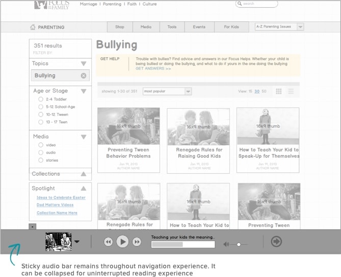
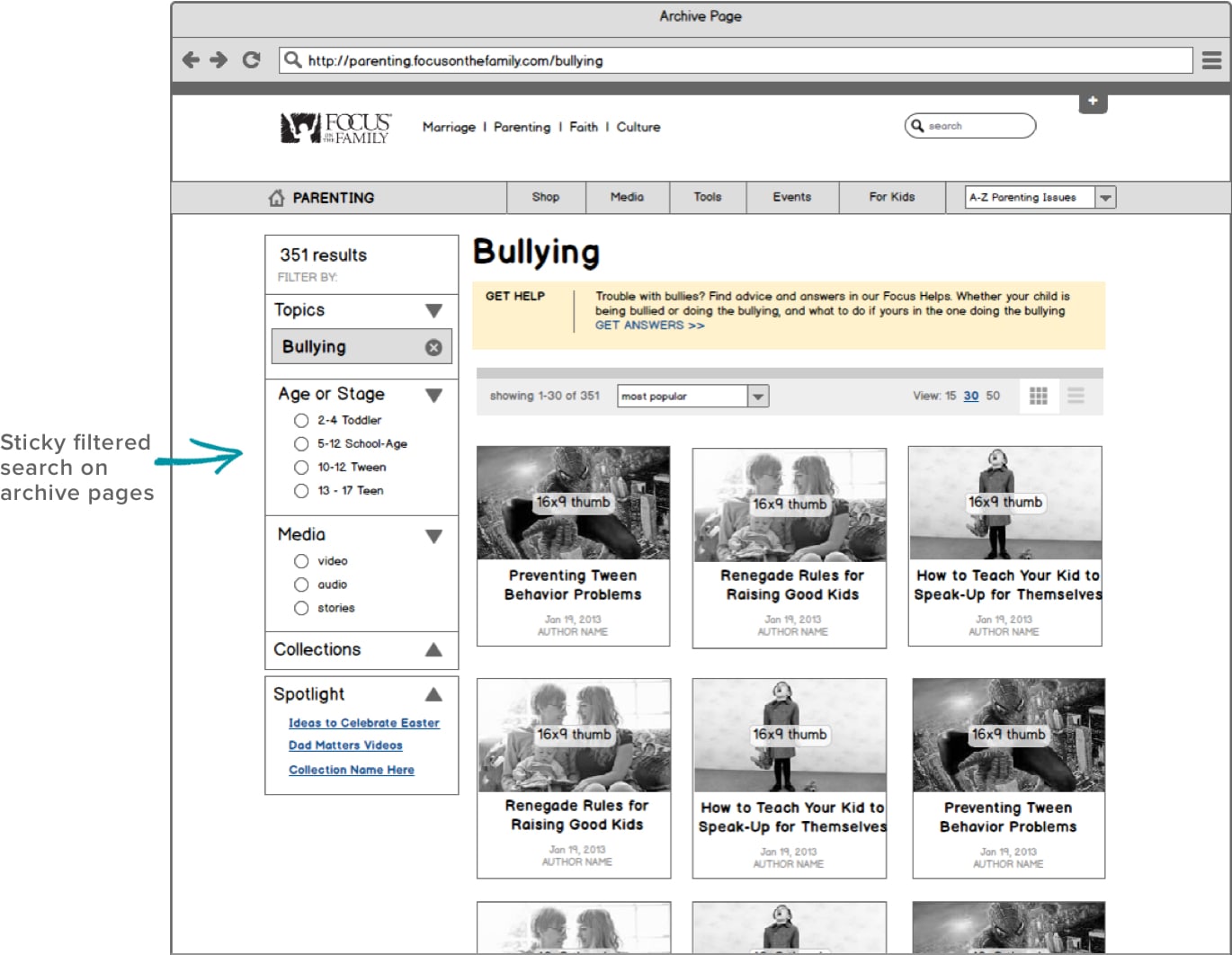
Once a user clicks into a topic on a channel page, filtered archives enable users to quickly and easily drill down to specific content.
FEATURES:
- Enables a user-controlled search experience
- Allows for contextual call-outs to link users to relevant cross-channel content (e.g. marriage vs parenting)
Building Smart Pathways into Content
Secondary navigation and fixed components also gives Focus another way to tie the different areas of the ministry together and highlight the strengths of the organization.
Ministry Header Navigation
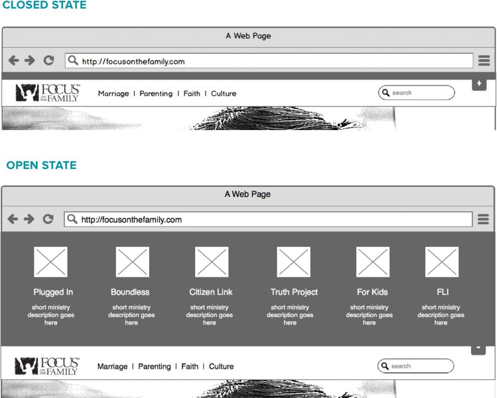
A fixed dropdown header brings together all of Focus on the Family and it’s affiliate sites under one “umbrella” for better brand awareness.
Ideas in an Instant
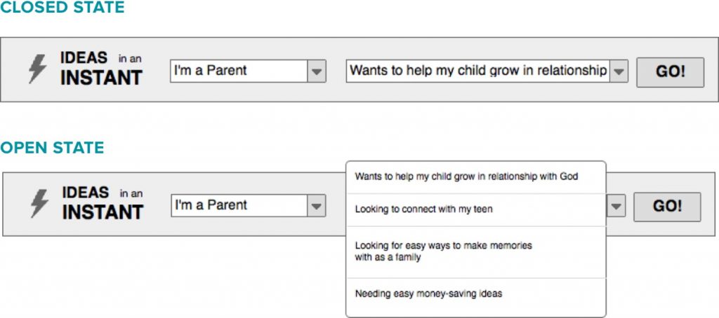
The “Ideas in an Instant” tool makes it simple for people to find content tailored for the specific needs identified from user research. Topics such as “I’m a parent looking to connect with my teen” or “I’m a spouse who needs date night ideas” gives users actionable ideas on how to solve everyday dilemmas.
Fixed Audio Player
Focus on the Family is known for its audio broadcasts and a large majority its users tune to at least one of its many broadcasts or shows. A fixed audio player at the bottom of the screen brings this flagship content to the forefront. Regardless of where you are on FOTF, there is always an audio player pinned to the bottom of the screen, thus multi-tasking users can listen uninterrupted while browsing.
